Final level art by 2D artist
Clarity in Combat: HUD Design and Art Direction for Competitive Gameplay
Visual Worldbuilding, Art Direction, and HUD UI for Zone Rush
My Role
Lead Product Designer
Timeline
Jan 2024 - Oct 2024
Team
3 engineers, 1 game designer, 1 2D artist
Project Context
While the team had previously shipped single-player game experiences, this was our first multiplayer combat mode. The existing visual approach from Outpost Runs was functional, but lacked identity:
Environments felt flat, tiled, and inorganic
Color usage was muted and inconsistent
Worldbuilding existed conceptually, but was not visually conveyed
Characters struggled to stand out from backgrounds
There was no documented visual direction or style guide to follow
The Challenge
Lead and align the team on narrative goals and art direction for the game level, produce polished UI HUD assets, and contribute to production-ready in-game assets.
Keep in mind:
Maintaining a kid-friendly and approachable design
The UI and designs should be sci-fi futuristic, but grounded in reality. All of the game objects and mechanics needed to make sense in the narrative world
This included the walls, capture points, and health packs
Make it stylized, but not too cartoonish. We want to introduce colours without making it look unrefined
Transitioning to the team’s first multiplayer mode exposed gaps in visual identity, environmental storytelling, and cross-disciplinary alignment, revealing the need for a artist-led, documented art direction.
The Solution
Created moodboards, leveraging AI and Google Search to align the team on tone and aesthetics
Collaborated closely with the game designer to ensure his ideas and vision were captured
Defined and documented visual systems for environment design, color, and worldbuilding
Produced key assets (HUD, capture points, health packs, loading screen)

Impact
Reduced art review cycles by 40% by establishing clear direction upfront
Increased matches of Zone Rush by 134% comparted to Outpost Runs
Improved artist confidence in direction and decision-making
The Approach
Moodboards & Exploration
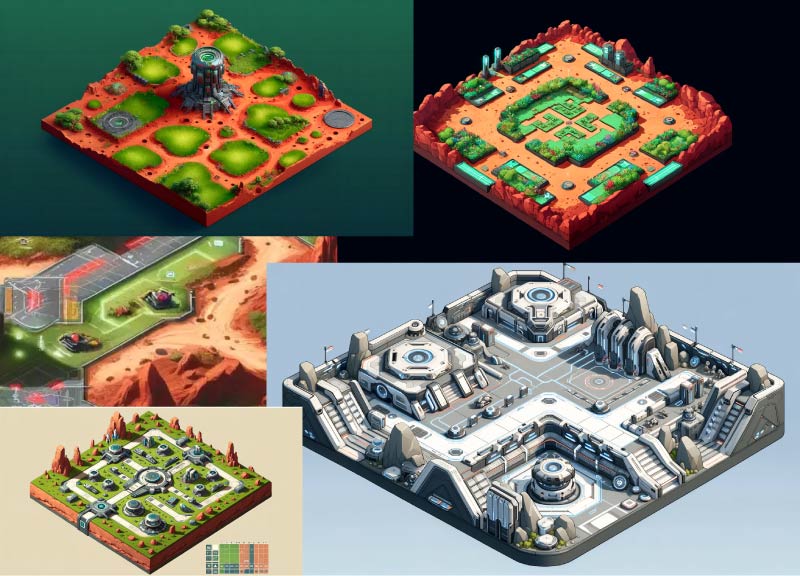
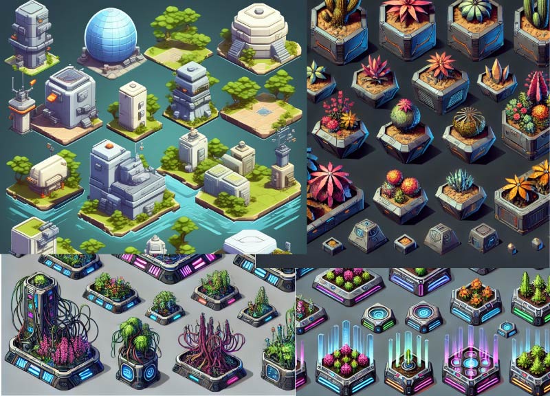
I scoured the internet for inspiration to establish tone, textures, colour, and concepts.
Using google search results, as well as AI-assisted image generation as a rapid ideation tool, we explored multiple visual tones and directions quickly while swapping ideas and suggestions before official production began.
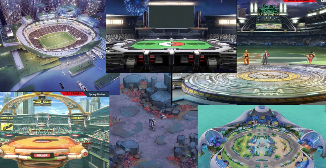
Moodboards exploring futuristic city stadiums and existing game battle arenas
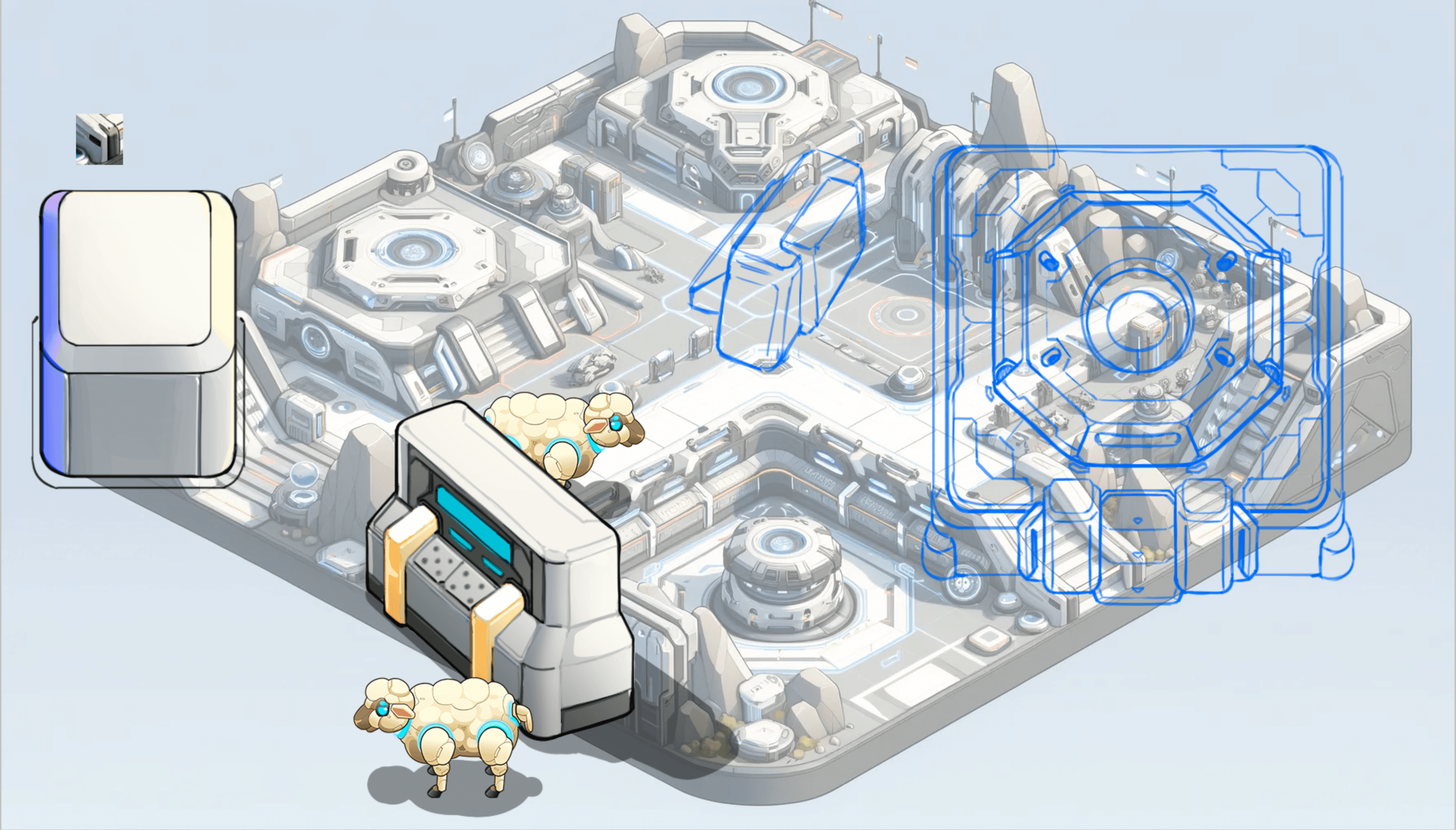
Rough concepts by the 2D Artist
I established weekly critique sessions where I reviewed the 2D artist's work, provided feedback, and helped iterate on designs.
Some designs didn't work out. Oftentimes concepts were ultimately out-of-scope. It was important that I made decisions that ensured the game shipped on time - which meant sacrificing some cool ideas.
Leadership & Process
I created visual guides and documentation that the 2D artists (and later artists we hired) that included colour and contrast rules, shape language, and worldbuilding constraints. These helped align the artists, reducing revision cycles and increasing the team's confidence in their work.
Environment Design
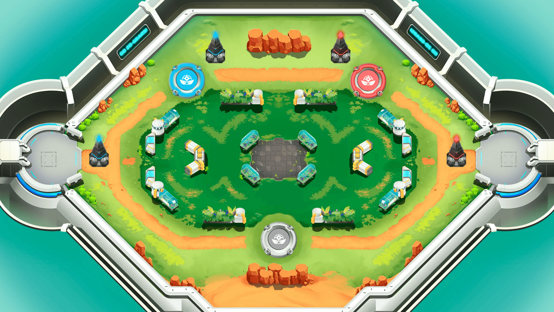
Transitioning from rigid tile layouts towards modular assets
Defining boundaries that were functional, not arbitrary
Using color contrast to clearly communicate lanes vs jungle
Color & Contrast
Introducing brighter, more saturated colours
Ensuring characters popped clearly from the environment
Avoiding muddy mid-tones during combat
Worldbuilding Through Assets
Every object and asset had a clear narrative explanation
Capture Points, walls, and props were designed to feel like real world structures
Asset Direction & Production Work
I also contributed hands-on production art to help solidify the style and set quality benchmarks.
Assets I personally created were:
In-game HUD (UI design)
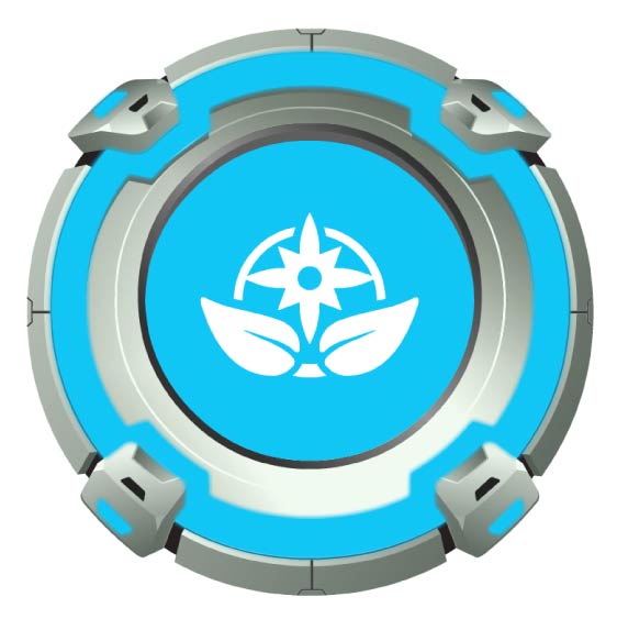
Capture Points (production art)
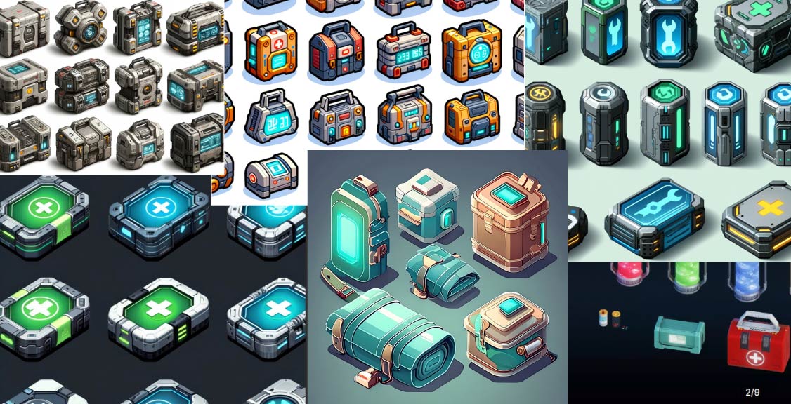
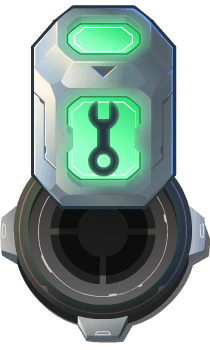
Health Pack (concept & production art)
Game thumbnail & loading screen (illustration)
In-Game HUD
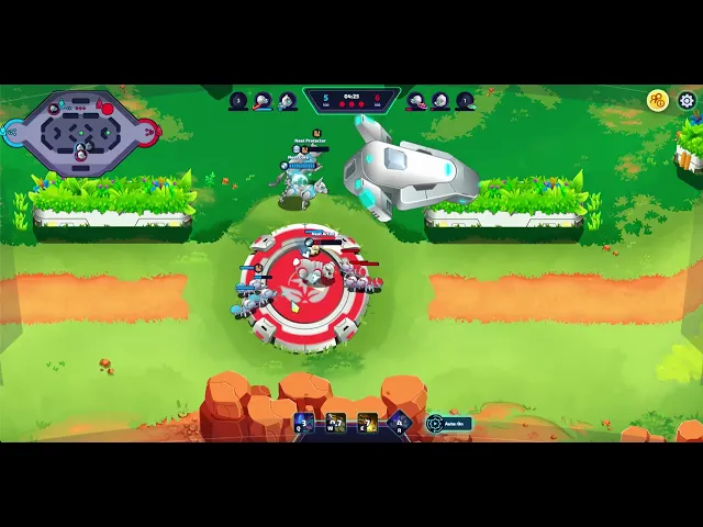
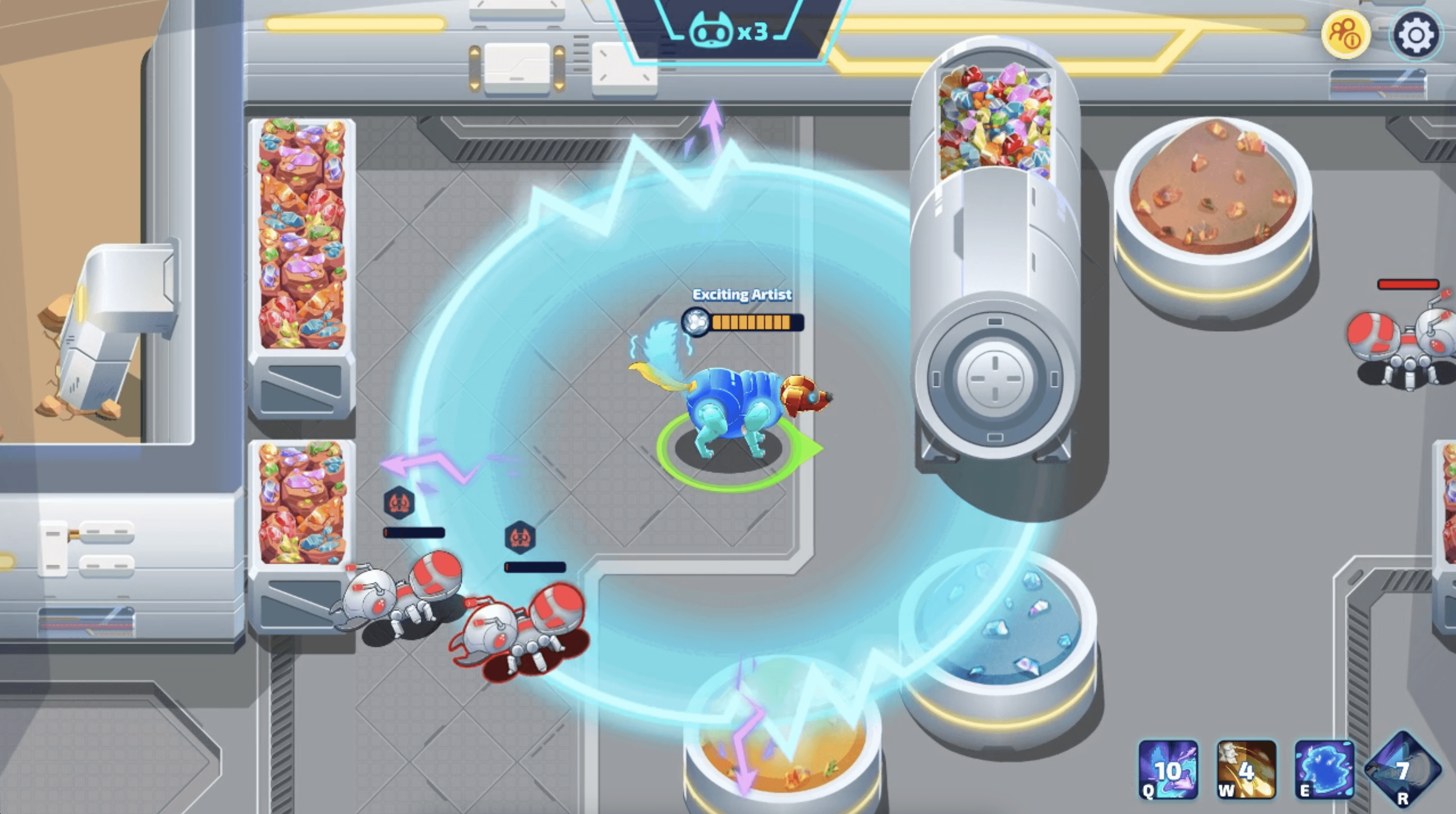
I followed established MOBA HUD conventions, relying on genre familiarity for instant readability in high-pressure gameplay. I decided to intentionally sacrifice visual flair and immersion for functionality, keeping the sci-fi futuristic aesthetic.
I designed the mini map, top player information bar, bottom ability bar, and health indicators for players, minions, and towers.

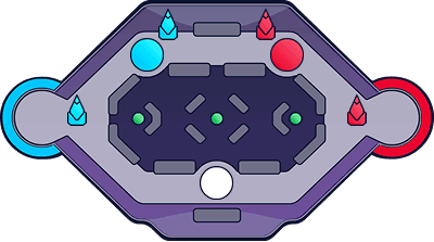
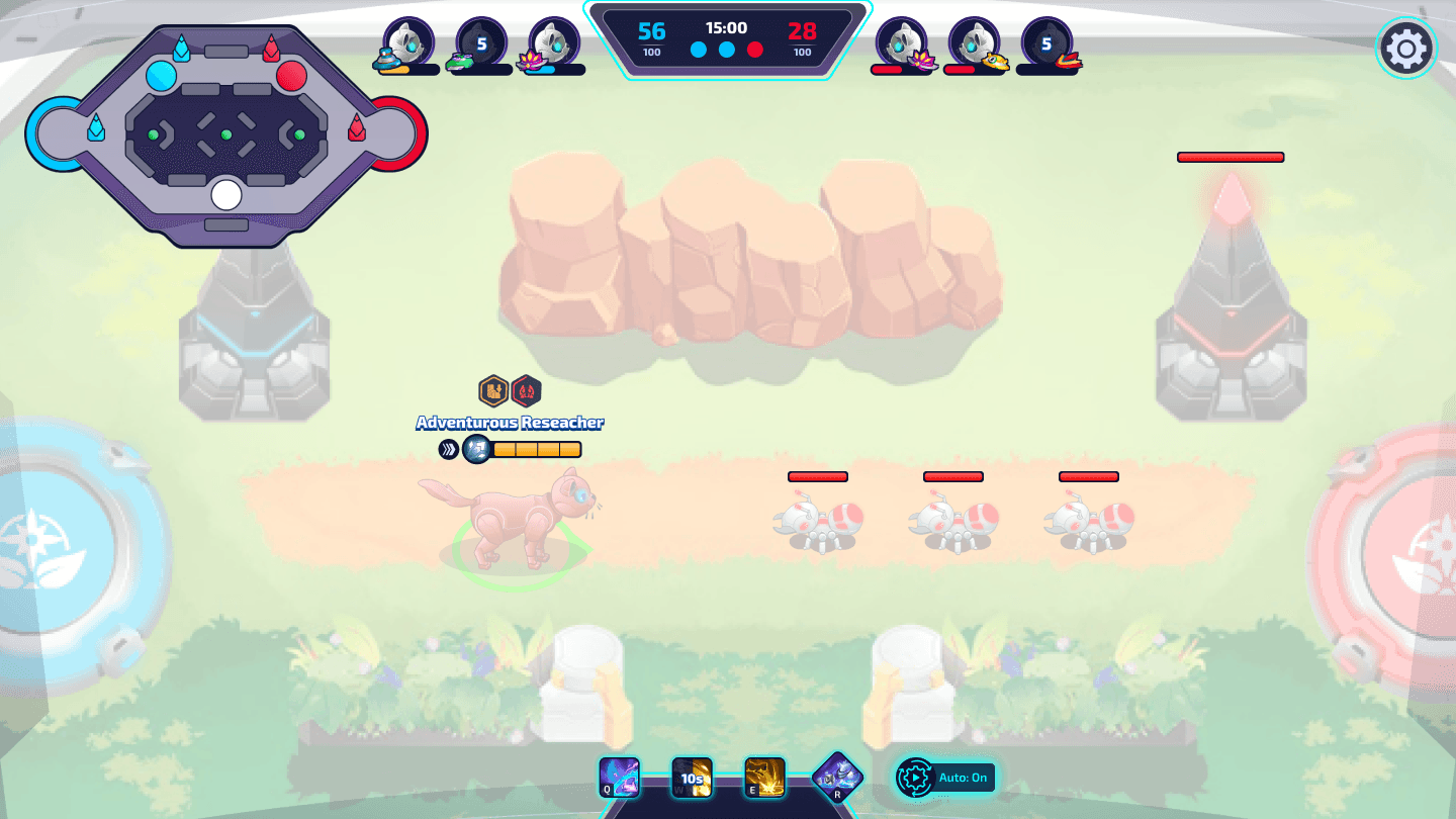
The HUD functioned as peripheral support, so the mini map was stripped to essentials, and the other components used high-contrast colours, including a yellow health bar for the current player.
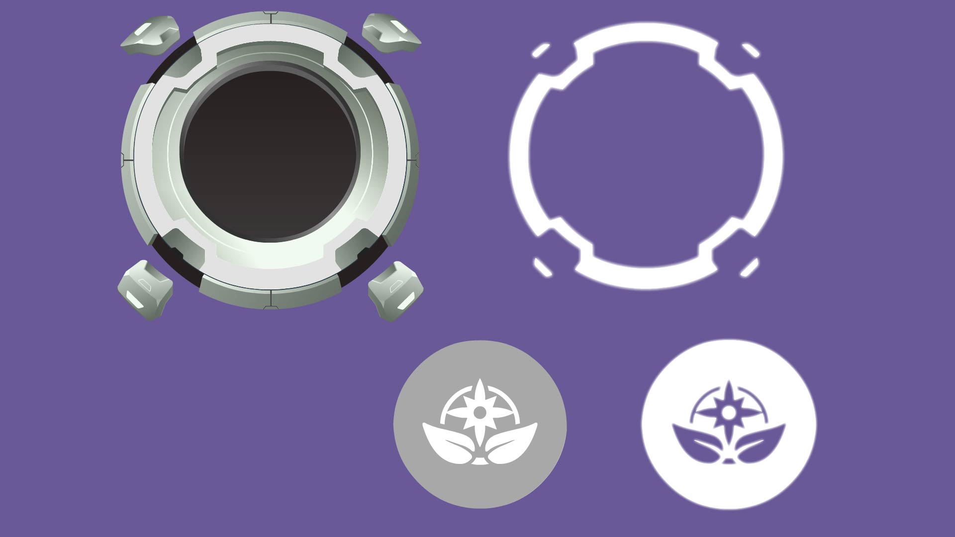
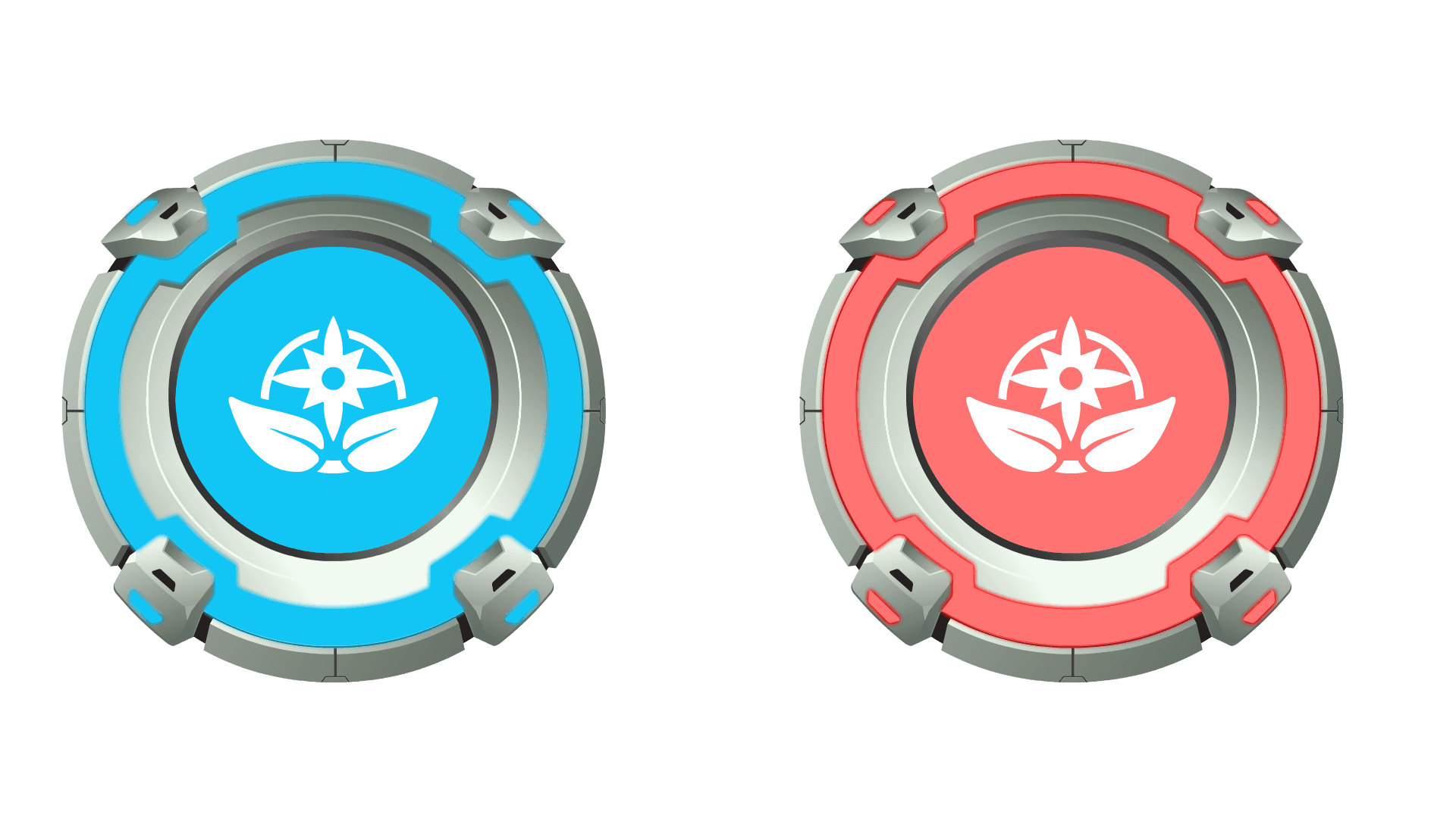
The Capture Point assets started as industrial fans that disperse seeds to transform the training ground into a grassy environment. They are to serve as a functional gameplay objects, while visually connecting the Zone Rush game mode to our casual game mode, Terraforming's core mechanics.
These assets needed to balance narrative storytelling with gameplay clarity. The silhouette was maintained and used colors and animation feedback to ensure instant readability during combat.
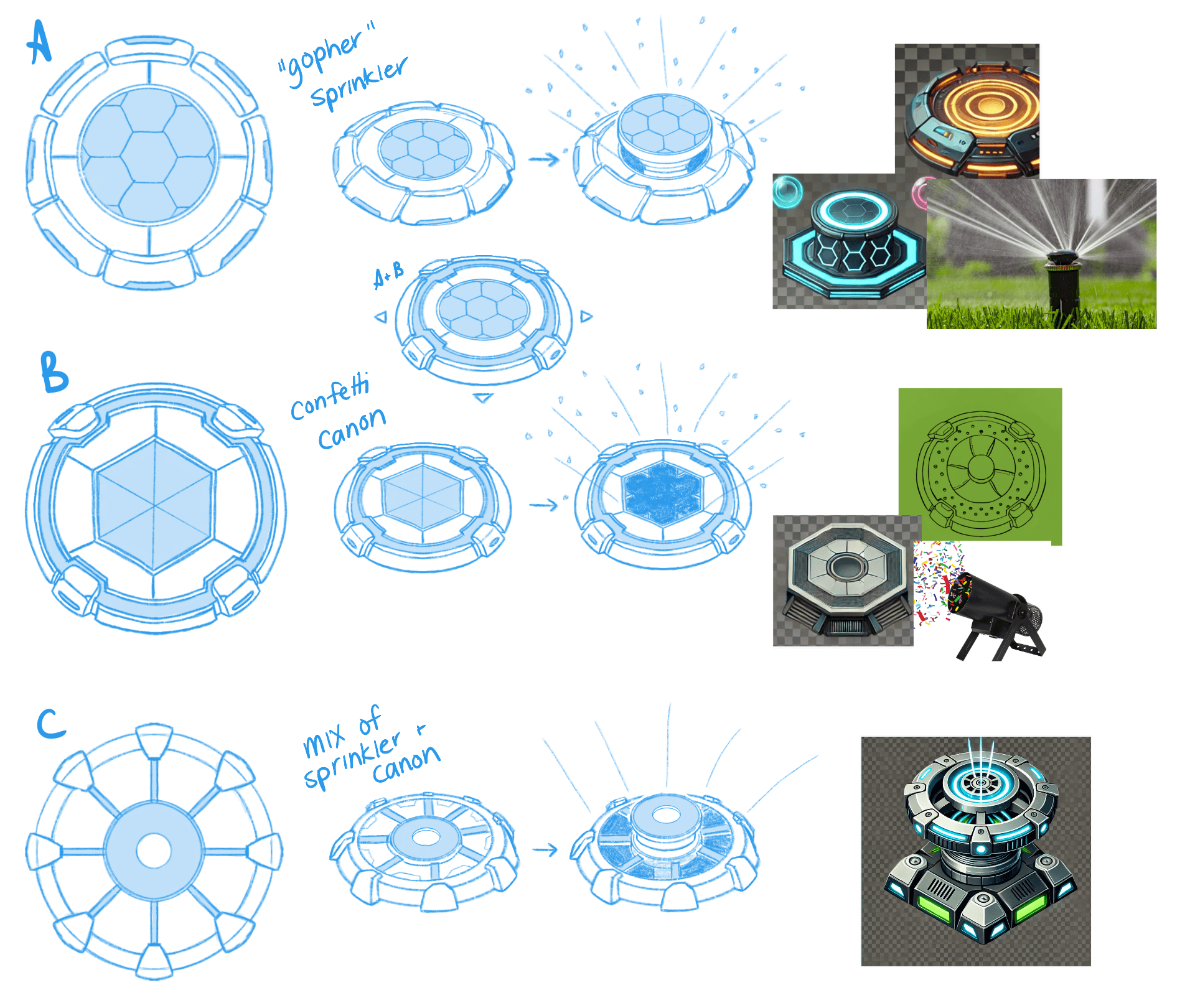
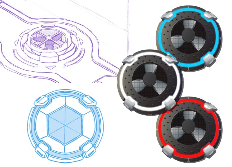
Players shouldn't have to guess what they're interacting with, functionality should take priority over decorative detail.
Final production assets
Health Pack
The Health Pack asset is a mechanical, gear-inspired item with a green glow that matches the polish and style of the Capture Points and Towers already in-game. Users run into this item to collect it, and gain an immediate amount of health back.
I decided the gear-inspired design would reinforced its functional role within the Zo-gear game system, and I chose the green glow to match the healing abilities and VFX, establishing a consistent visual language around recovery.
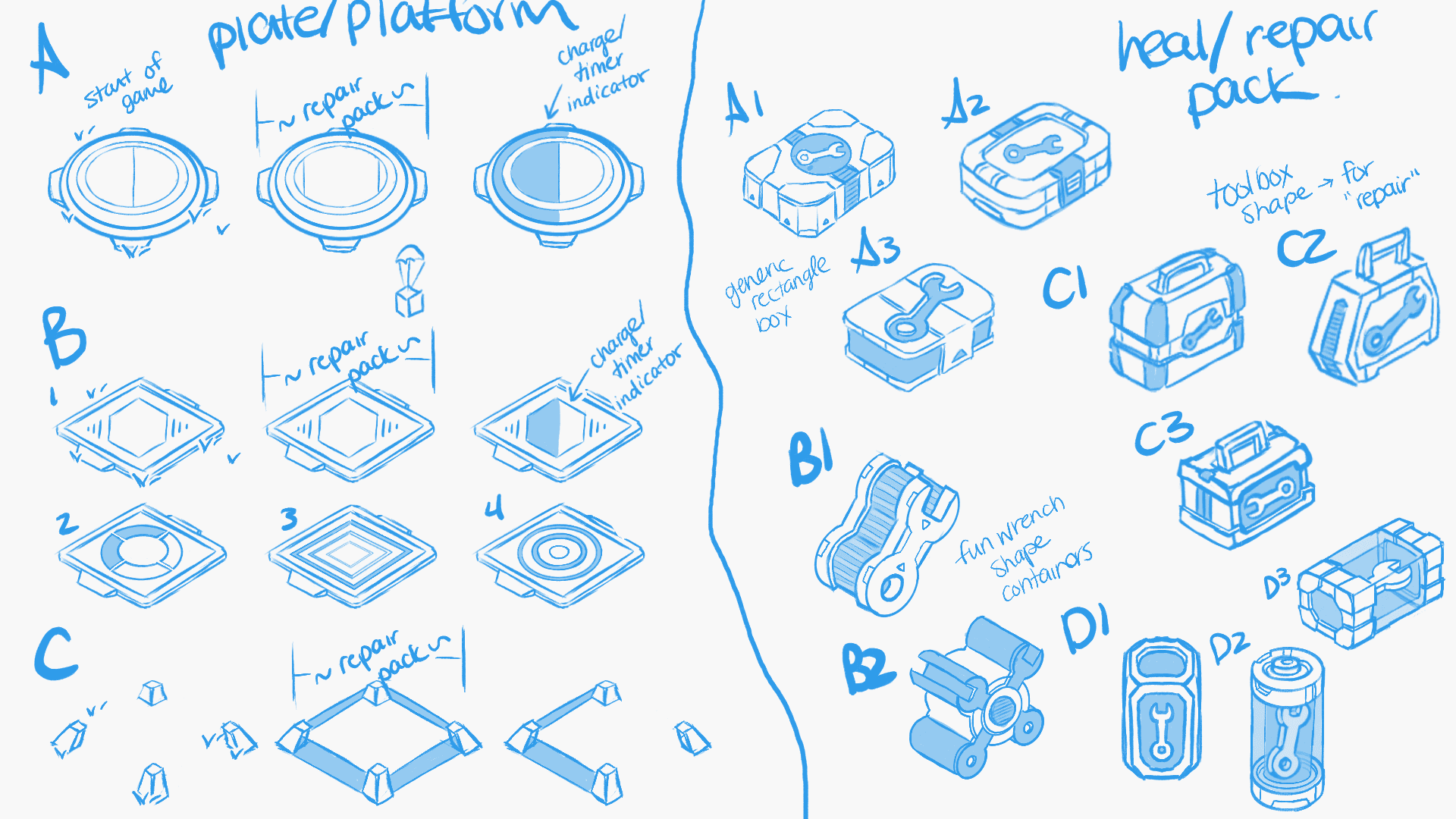
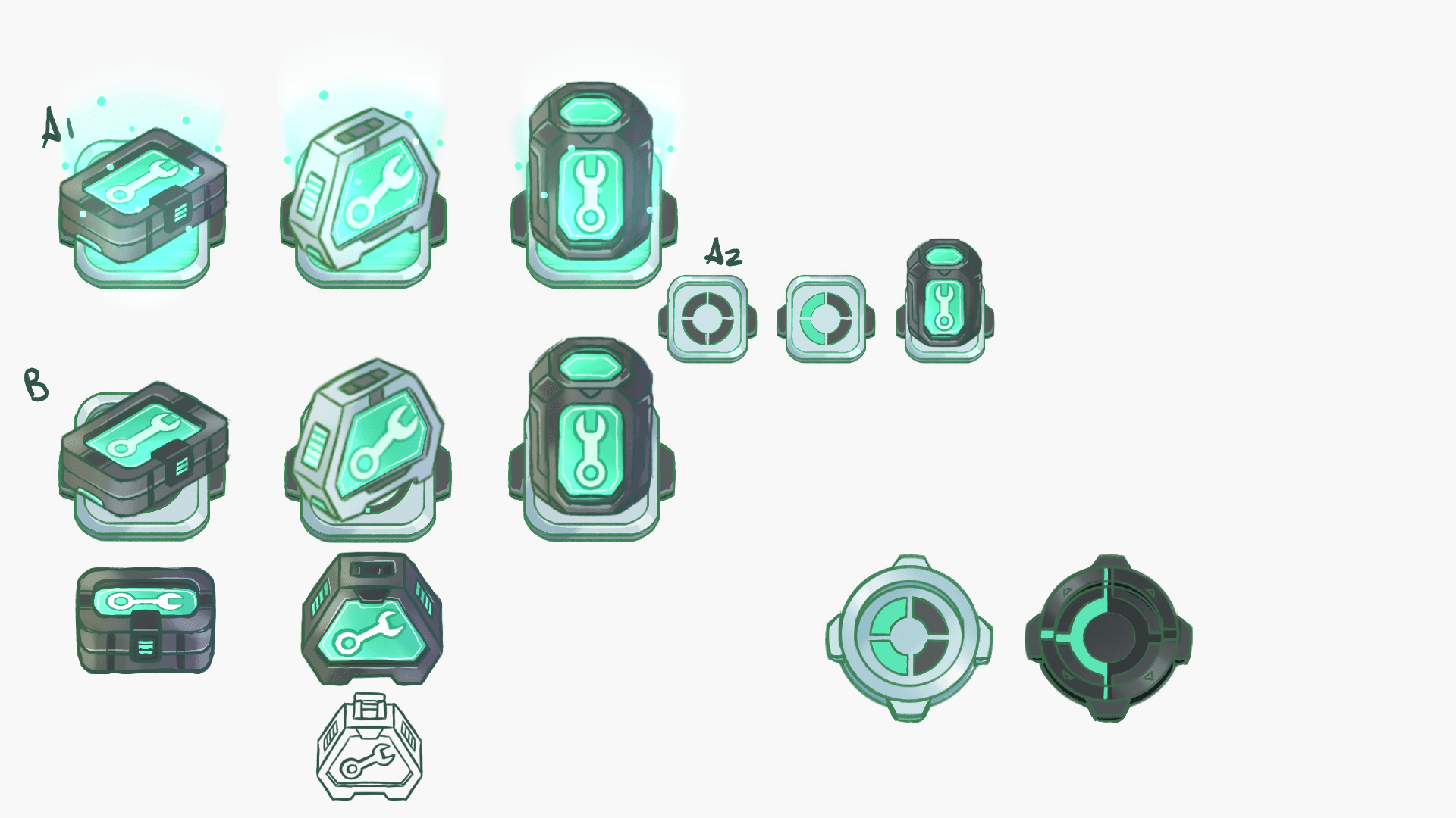
Final production assets
I outlined a storyboard, of sorts, for the animation, as well as separated the assets to be used for animation.
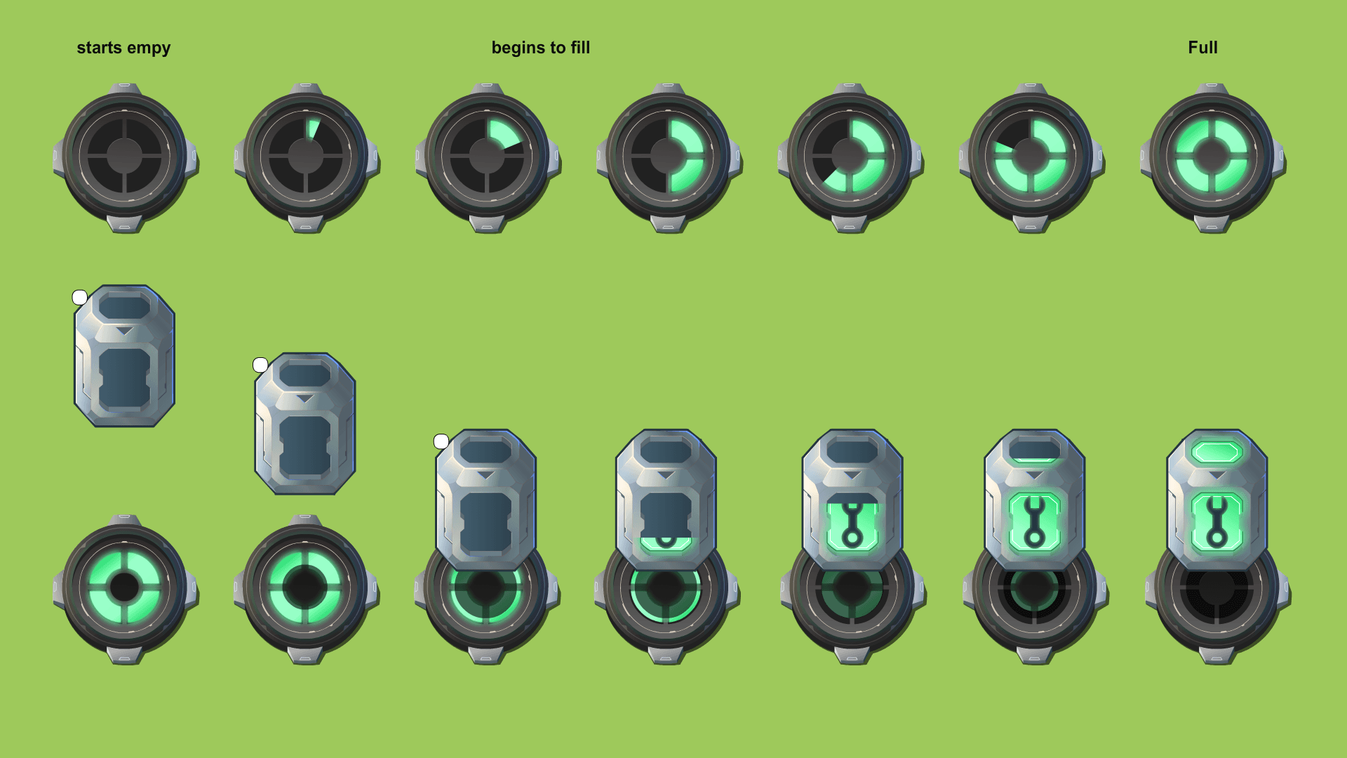
Consistency with established styles contributes to a stronger, more cohesive gameplay and narrative-building experience.
Loading Screen Illustration
I pitched and advocated to further strengthen the game's narrative and guide the story through an illustrated loading screen, that aimed to establish the environment and mood, showcase the scale and atmosphere of the training arena.
It was made using blender for the building layout, and Procreate for the final artwork.
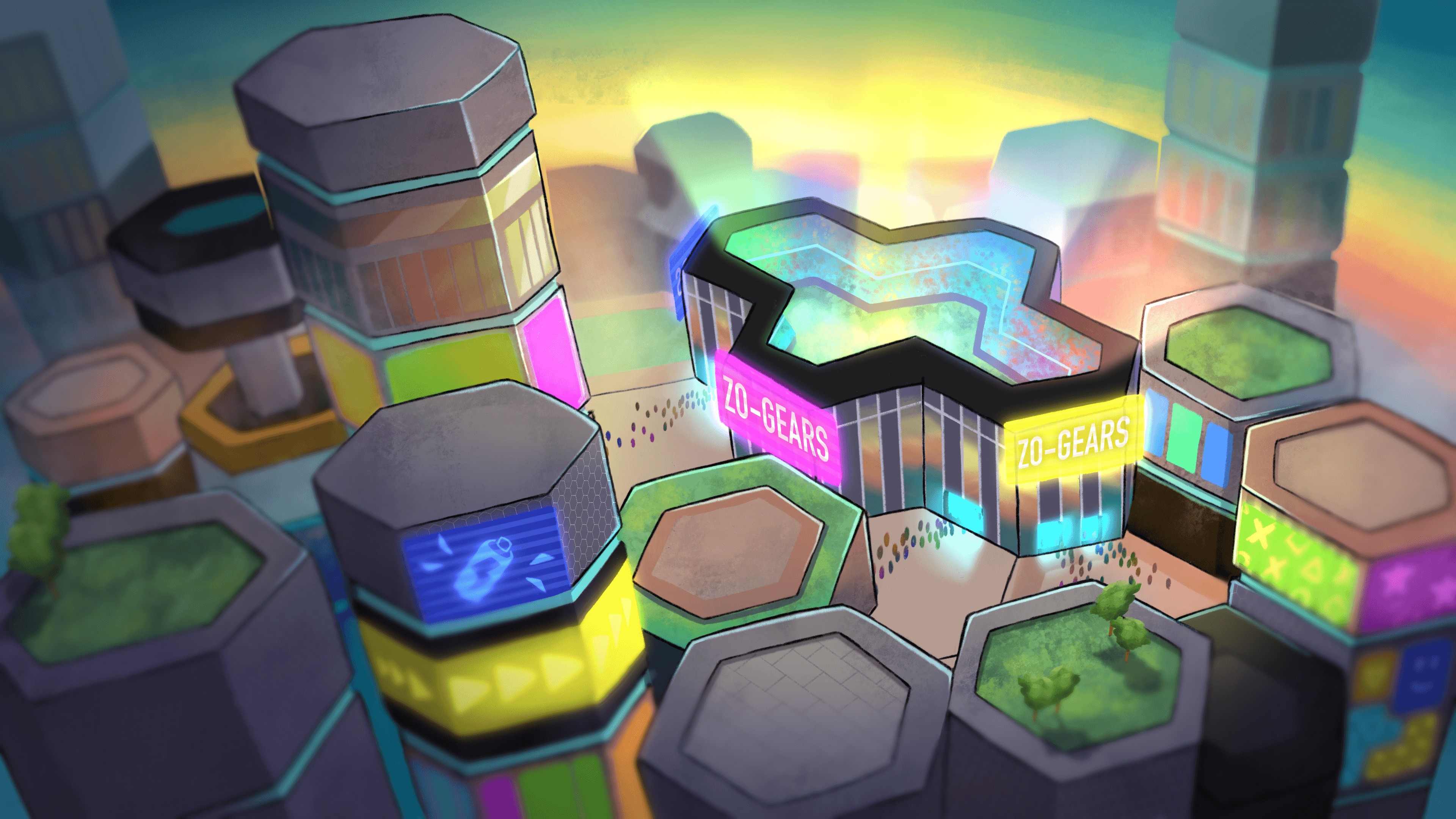
Final illustration

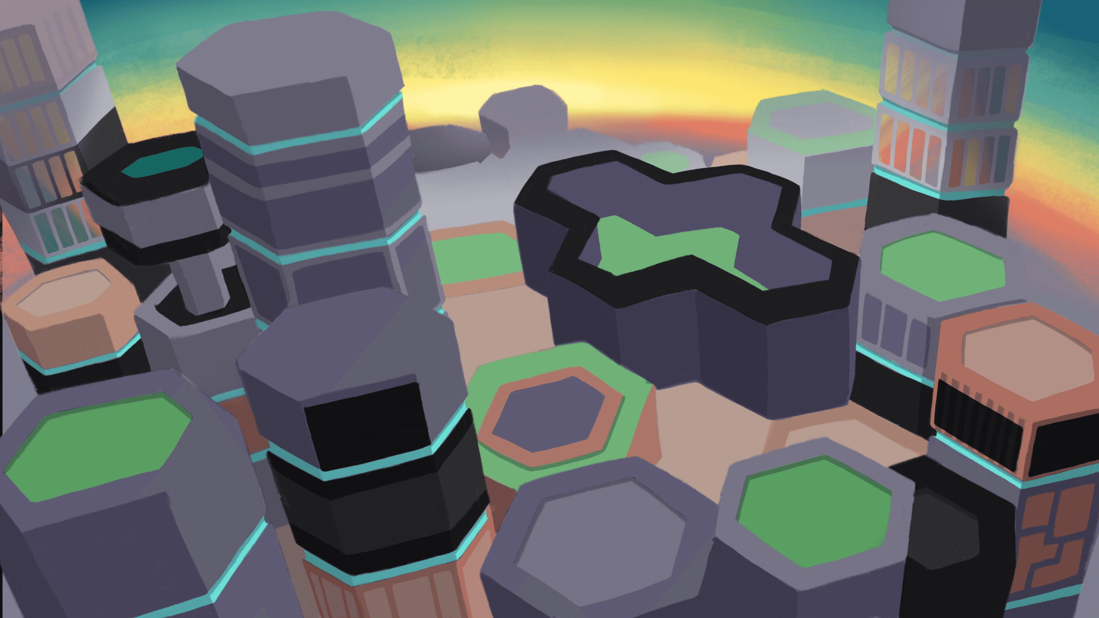
Final Zone Rush level art
Impact
Outcome
With the established new visual direction:
The game world felt developed and polished
Artists were more confident in their decisions
Visual consistency was easier to maintain
And kids loved the new game mode
For me, this project solidified the importance and impact of clear art direction and guidance in a collaborative game development environment.
Click to watch Zone Rush gameplay!
Notice how the HUD is effective in conveying information while taking a visual backseat. See how the capture points and health pack serve a narrative and gameplay mechanic purpose.
Reflections
This project reinforced several core lessons about art direction:
Artiststhrive when given clear constraints. Having an outlined, documented visual direction helped them concept faster, reduce feedback loops, and deliver assets on time.
Narrative and visuals can be developed together, so they coexist and balance each other out.
Art direction is more about communication than taste. My job is about bringing the Game Designer's ideas to life, collaborating about approach, and advocating for well defined requirements for the artists to follow.
If revisiting this project today, I would love to:
Further formalize the work into a living style guide
Explore more fun, illustrative visuals to expand the narrative while maintaining readability (something I had to sacrifice for launch)

