Designing Short Learning Cycles: From Vague Feature to Core Value Proposition
Turning teacher data into actionable interventions to drive student learning outcomes
My Role
Product Designer
Timeline
Aug 2024 - Mar 2025
Team
1 product manager, 2 engineers, executives, account managers
Project Context
Knowledgehook had a feature called Impact Challenges - a vague concept that loosely guided teachers through assigning activities → intervening → measuring growth. But it wasn't well-communicated or integrated into the product experience.
The Activity Report showed which students struggled, but offered no guidance on what to do next. Just a "Measure Growth" button with no context. Teachers were using the platform to assign homework, not to drive learning outcomes.
The Challenge
Without a clear intervention workflow, Knowledgehook couldn't prove its value to districts. Renewals were at risk, and competitors were beginning to offer intervention guidance. The company needed to differentiate and demonstrate that the platform could meaningfully improve student math scores.
The Impact Challenge flow needed to be redesigned across three key pages: GameShow/Mission Reports, Focus Areas, and Teacher Supports. Updating these would become the "Short Learning Cycles" flow, Knowledgehook's core value proposition.
Without a clear path from data to action, Knowledgehook couldn't prove its value. Districts were at renewal risk, and we needed to differentiate from competitors who were beginning to offer intervention guidance.
The Solution
My job was to redesign the teacher experience into a clear, step-by-step workflow:
identify struggling students
understand which topics need intervention
get specific support resources
assign follow-up to measure growth
Impact
Improved the adoption of growth activities - increasing number of weekly activities assigned by ~16%
Improved engagement with teacher supports - increasing document viewed events by 25.65 percent points
One district that fully adopted the SLC process saw measurable improvements in their 2024/25 EQAO math scores
The Approach
I collaborated across teams to define the workflow:
Collaborated with the PM to translate business requirements into user flows
Designed and iterated on mockups, testing with account managers who work directly with teachers
Validated the intervention prioritization system (color-coding, thresholds) with education stakeholders
Personally coded and shipped the Activity Report updates to accelerate delivery
As well, this project had some constraints:
Limited direct user access meant I relied on account manager insights and internal education consultant's feedback
The Activity Report changes were faster to ship (I coded them myself), while the Focus Areas and Teacher Supports pages required full engineering sprint cycles
We needed to ship quickly to support sales conversations and avoid district renewal risks
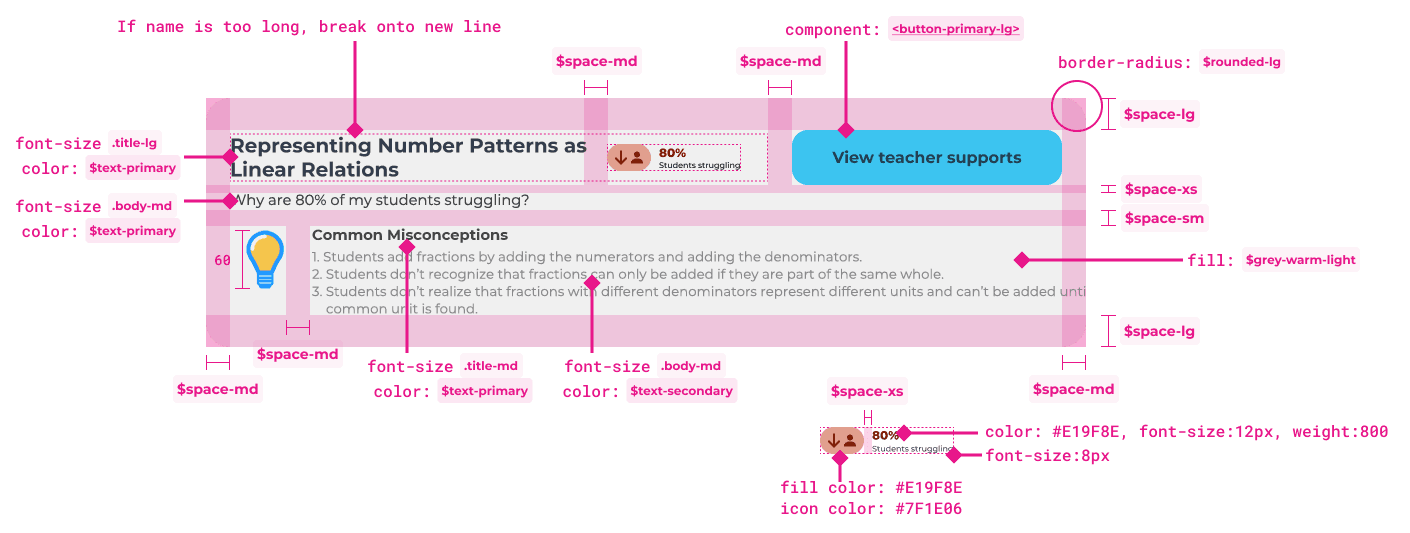
Page 1: GameShow/Mission Reports - Surfacing identified gaps
Original GameShow and Mission Reports pages mixed activity data with focus area insights, making it unclear what teachers should focus on.
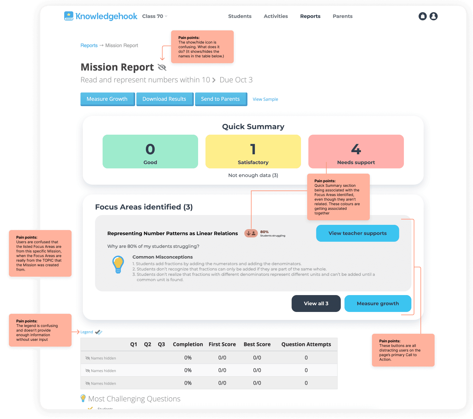
The Focus Areas identified container was in the middle of the Mission Reports, even though it wasn't exclusively related. This caused a myriad of confusion and pain points.
I coded and shipped these changes myself to accelerate delivery
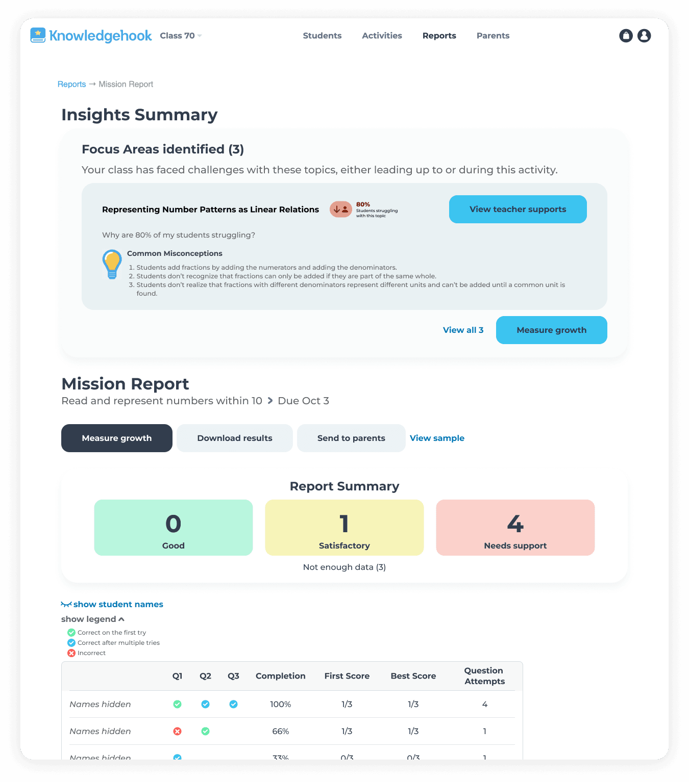
Final Mission Report page
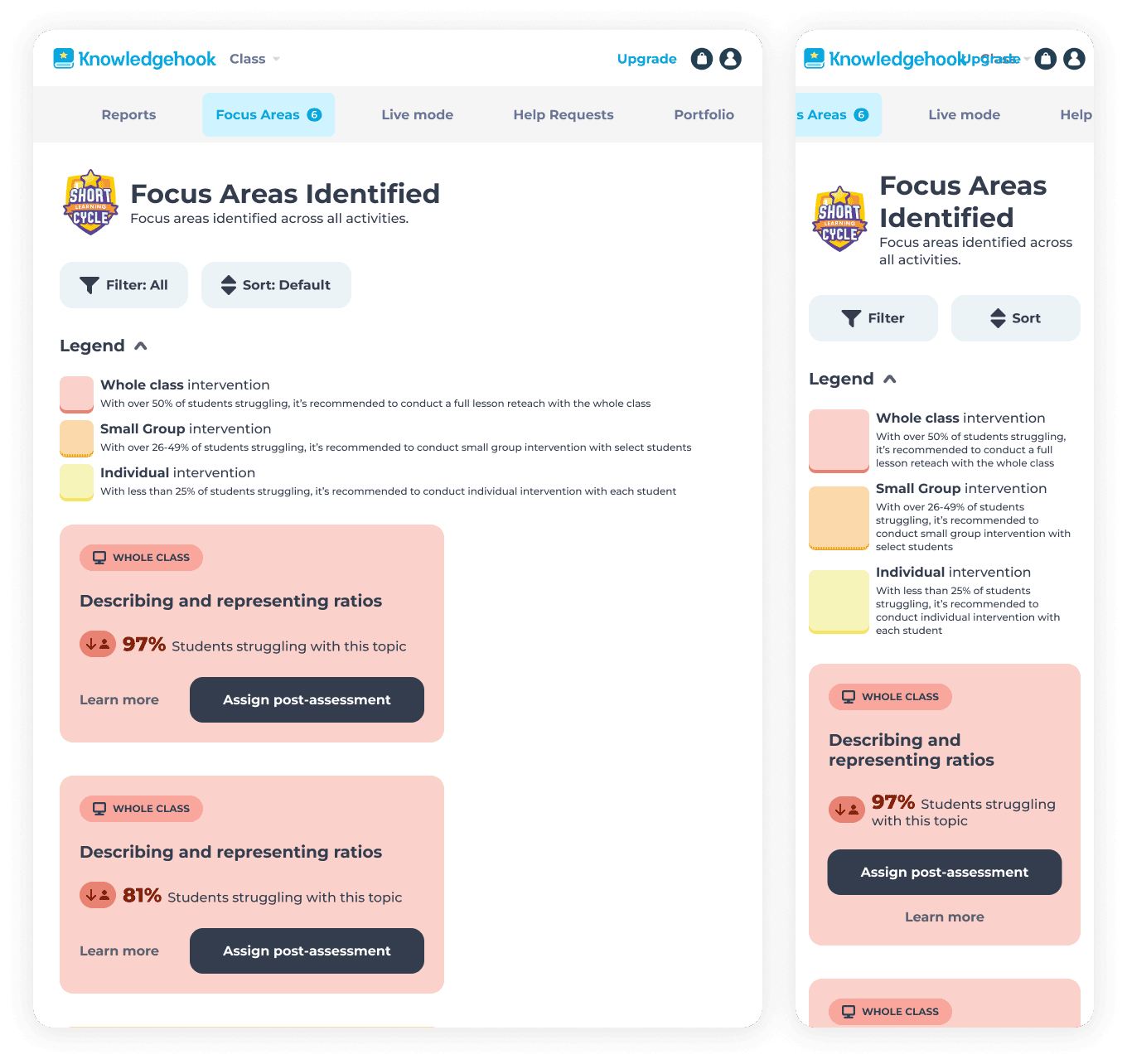
I ensured the page was responsive for tablet and mobile breakpoints
Why this mattered:
We tied clearly identified gaps directly to the Missions and curriculum content they came from. While the identified gaps may not have come from that Mission or GameShow activity specifically, it still tied the connection to the content, allowing teachers to understand which topics or strands students were struggling with, and which activities to assign again to measure student learning.
What I'd improve
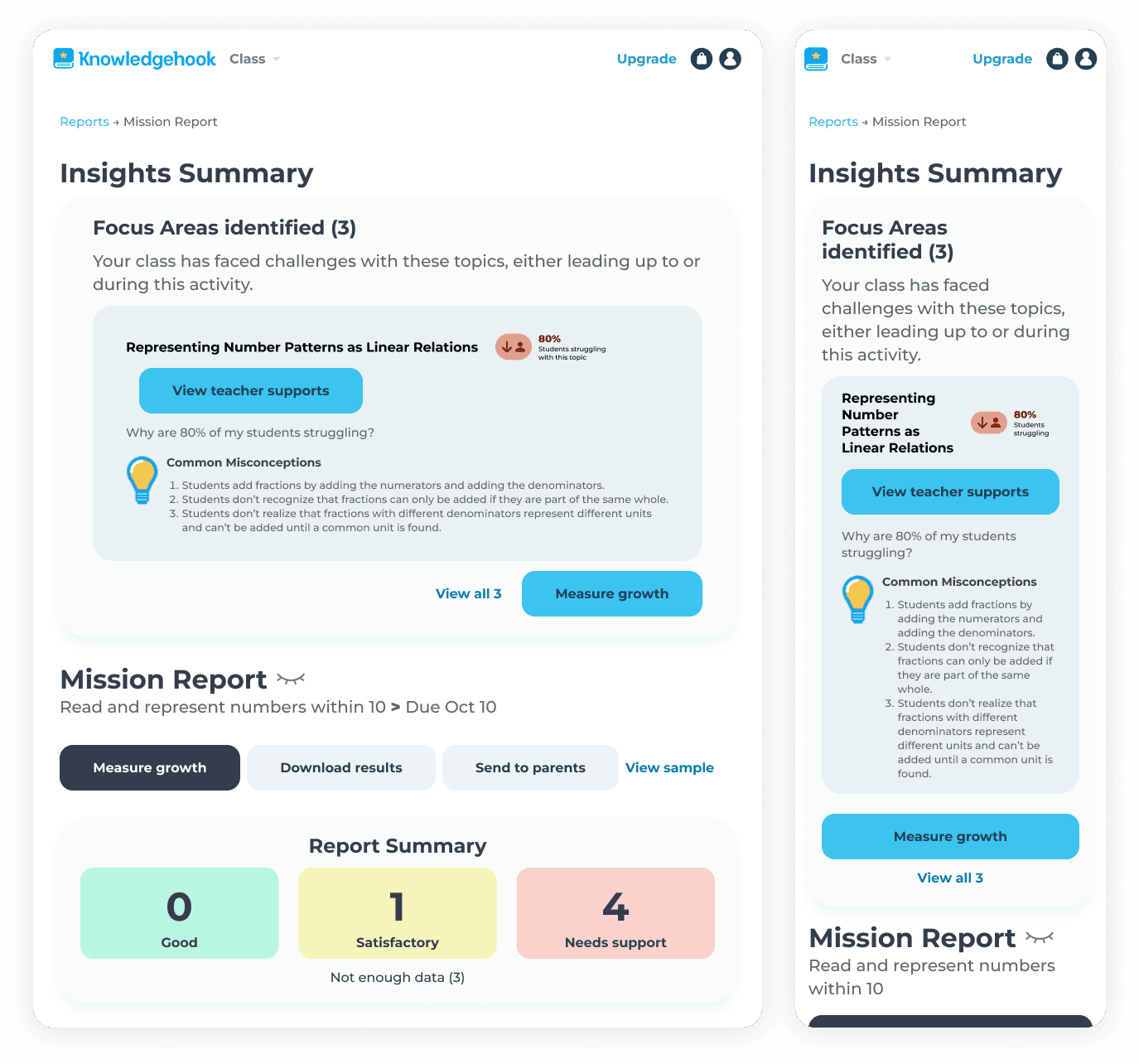
The Focus Areas section still feels too integrated with the mission data. If I were to redesign this again, I would:
add a distinct background colour to fully separate it from the Mission Report page content
adjust the layout of each Focus Area's card to be a collapsible accordion
move each CTA for the Focus Areas to within each accordion content, clarifying the connection to each CTA on the page
add a contextual badge, further communicating the topic-wide nature of the Insights Summary
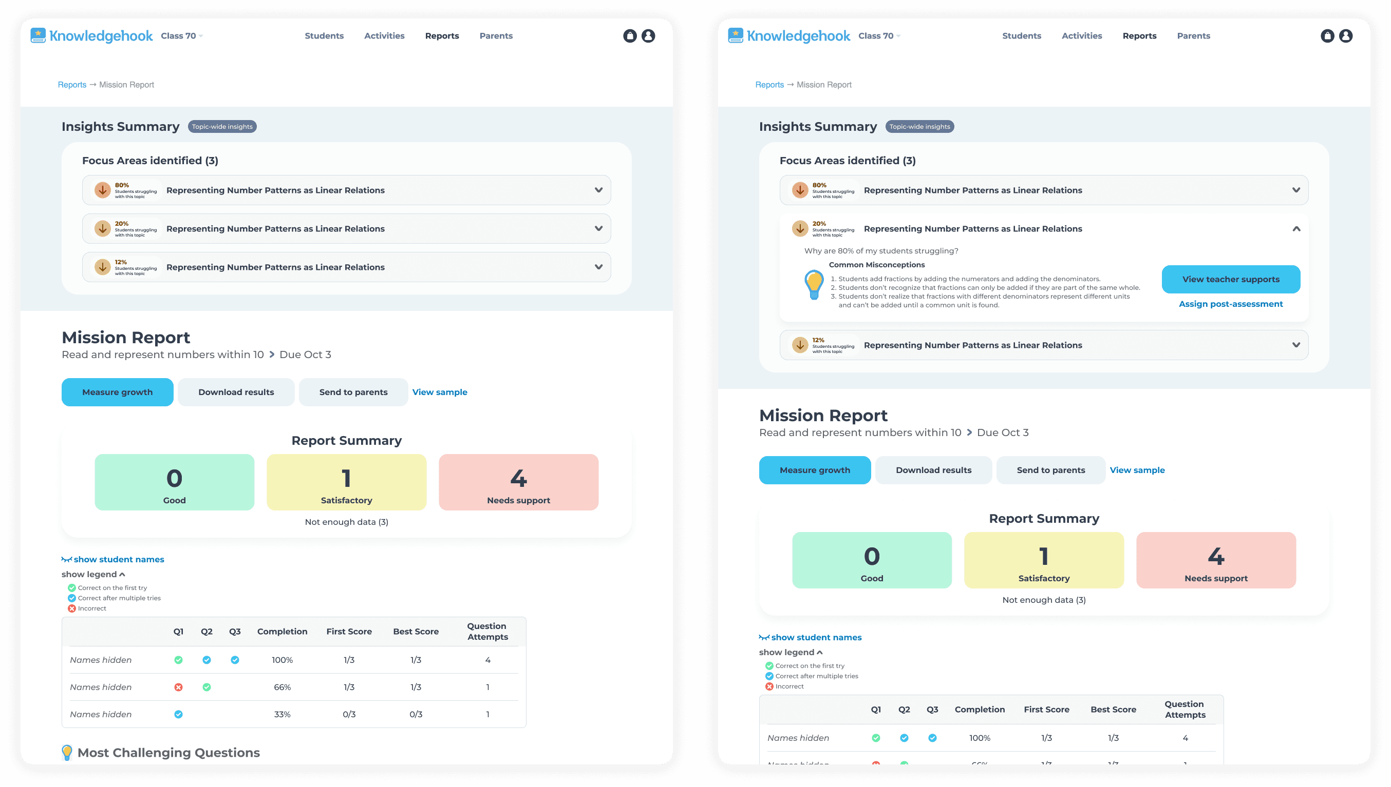
A redesign I did, exploring a way we could further improve the experience, by making the Insight Summary even more distinct, improving the visual hierarchy of the page, removing clutter, allowing users to quickly scan the most important information, but dive deeper for more insights.
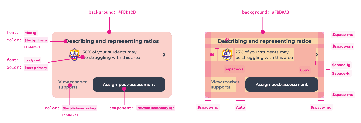
Page 2: Focus Areas - Displaying known gaps
Teachers needed a place to quickly understand which topics students were struggling with and the severity of how many students were struggling, so they could plan any required interventions. This page served as a summary of identified gaps, so that teachers didn't have to drill down into specific activity report pages to find these insights.
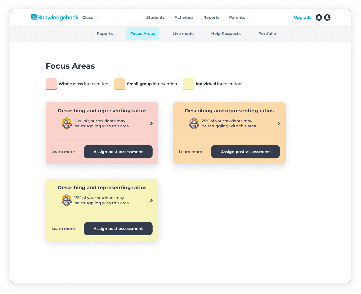
My design choices:
Color-coded intervention cards based on severity:
Red: 50%+ struggling → Whole class intervention
Orange: 31-49% struggling → Small group intervention
Yellow: 10-30% struggling → Individual intervention
These colours carried over from the "50% of students struggling" data point from the activity Report Insights Summary
Each card shows: gap topic, percentage of students struggling, and two clear next actions
I chose the black secondary button for the primary CTA to ensure accessibility and contrast against the coloured cards
Added a legend to explain the color system
"Learn More" link navigates to detailed Teacher Supports for each gap
Why this works
Teachers can scan the page and immediately prioritize: "I need to do a whole-class lesson on fractions, then small-group work on decimals." And then they could dive into each card to follow the necessary steps for intervention.
What I'd improve:
move the SLC logo from each individual card to directly beside the main header, to clarify that all parts of this page are a step in the Short Learning Cycle
add more context in the form of a traditional legend, providing further explanation text to clarify what types of intervention there are
add minor icons and components from elsewhere in the platform related to Focus Areas to build pattern recognition
The icons within the pills for whole class, small group and individual
The user icon and arrow for students struggling
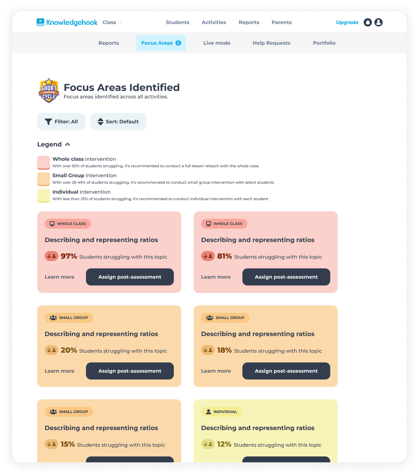
Providing more context and information in the page allows users to confidently make the right decisions.
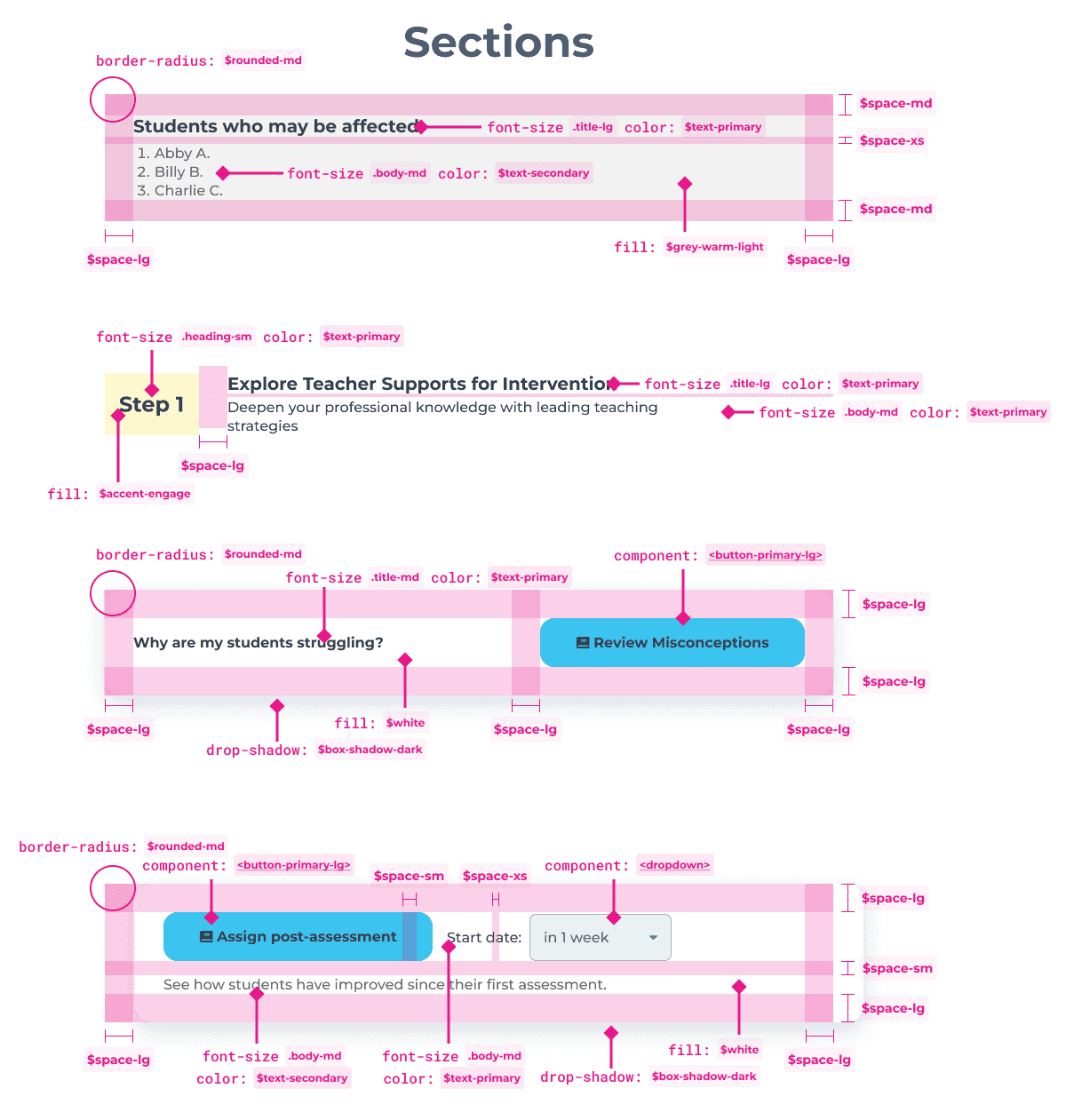
Page 3: Teacher Supports - insights and actions
This page answers the critical question users ask: "Okay, I know students are struggling with fractions - now what?"
Key decisions:
Clear list of which specific students are struggling
Two-step guidance:
Step 1: Explore teacher resources (misconception charts, math background, intervention questions) - linked directly when available
Step 2: Measure growth by assigning a follow-up activity
Follow-up assignment modal allows teachers to schedule activities in advance
Simple, scannable layout that doesn't overwhelm
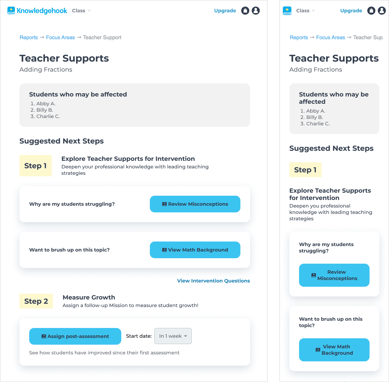
Content had already created intervention resources - my job was to surface them at the right moment in the workflow and make the next steps obvious.
Throughout the entire process, I provided comprehensive redlined specs as hand off documentation to engineers.
Impact
Short Learning Cycles became the company's primary value proposition
After shipping this workflow, the company rebranded the feature as "Short Learning Cycles" (SLCs) - a clear, repeatable process for improving student outcomes. Account managers began promoting SLCs in all training sessions as the core way to use Knowledgehook.
Reflection
What I learned
This was one of my first major product design projects at Knowledgehook, and while it shipped successfully and drove business impact, I learned valuable lessons:
Clear, step-by-step guidance reduced ambiguity for teachers
Color-coding intervention levels made prioritization intuitive
Coding the Activity Report changes myself accelerated shipping
The flow works - teachers are completing SLCs and students are improving. But designing complex, multi-page workflows requires stepping back to map the entire experience, not just polishing individual screens. This project taught me to be a more strategic, questioning designer.
What I would do differently
Map the full user flow across the entire platform. I relied heavily on PM requirements rather than doing my own flow mapping. This would have helped me identify confusion points earlier.
Push back on initial UX ideas that saved scope but didn't mean user needs. I accepted some information architecture decisions that, in hindsight, still confuse first-time users. I've learned to question requirements and advocate for users more strongly.
Add more clear communication and navigation. If I were to redesign this flow today, I'd add clearer indicators that users are "in" a Short Learning Cycle, showing them which step they're on and what comes next.

Contact me: aszczepanowski@outlook.com
Copyright © Amy Szczepanowski 2026