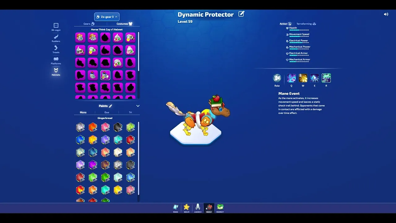
Final Build screen
Embracing the Mess: How Iteration Refined Character Customization
Turning an overwhelming feature into a smooth experience
My Role
Product Designer (Game UI Art)
Timeline
Jun 2023 - Jan 2024
Team
2 engineers, 2 game designers
Project Context
Light of the Zo-gears, being a predominantly combat-focused game, featured players swapping out 4 parts to customize their robot animal's look, abilities, and attacks.
The game was intended for elementary and high-school aged kids, playing across web browsers of all different screen sizes.
The game needed an interface to: display inventory, show ability information and stats, and allow customization and previews.
The Challenge
Take the Game Designer's initial mockup, which prioritized displaying part information, ability skills, and character customizations, and polish the final interface using our existing design system.
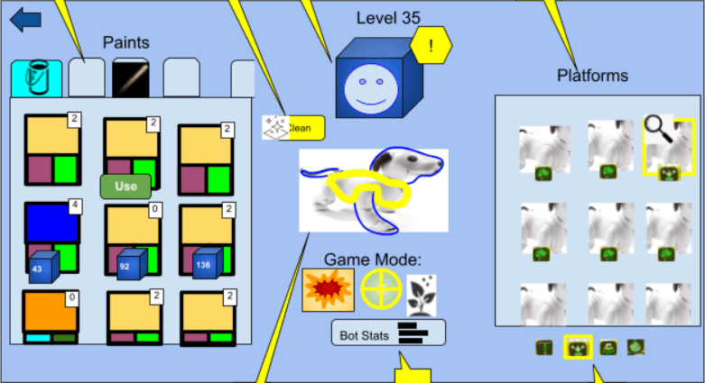
Initial rough mockup from the Game Designer
The Solution
Conduct internal stakeholder interviews to understand core user and business needs
Design multiple iterations when new requirements arose
Work within an existing Design System, maintaining style consistency
Create custom ability icons for all characters
Impact
Shipped an improved interface that was responsive, intuitive, and served user needs
Increased user customizations by 20%
Improved user engagement with the overall game world and platform
The Approach
I decided to first translate his mockup using our existing design system, preserving the layout and information hierarchy.
But I knew that the information was overloaded and there were competing CTAs with no clear primary action - which would result in overwhelmed users.
Mobile made it worse, it just looked cramped and chaotic
All assets used were placeholder, not final assets.
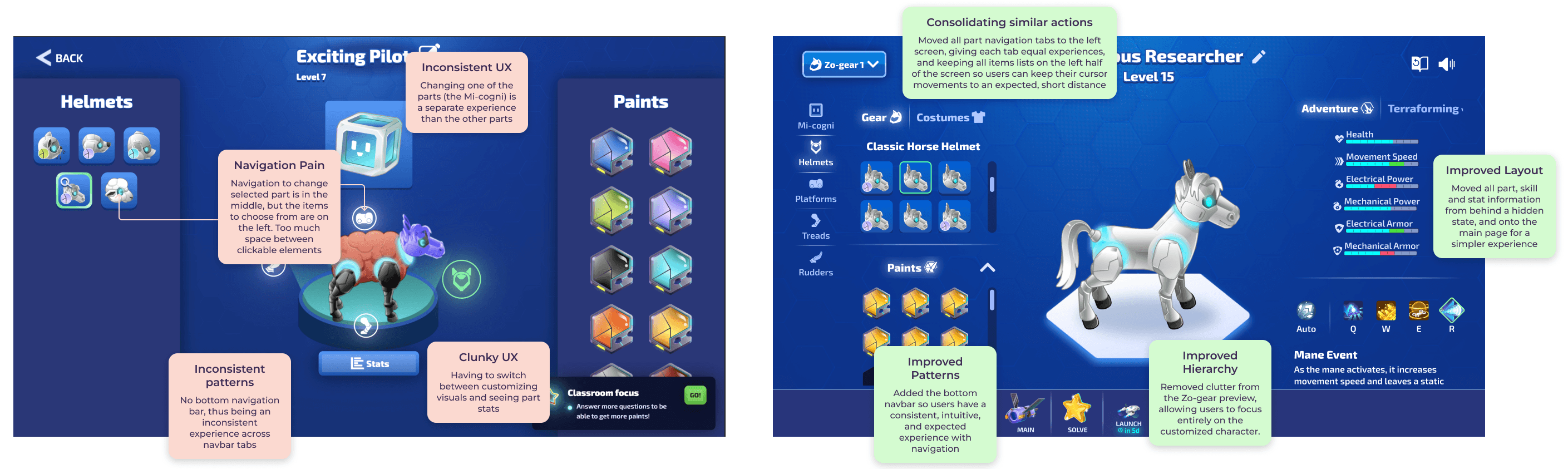
Turning Point 1: The need for user research
I decided to take a step back and hold user interviews and feedback sessions with the Game Designer to understand the core functionality, fundamental user journey, and the primary actions.
The interviews resulted in the Game Designer's priorities not changing - maximum visibility of information was still the highest priority. The primary action was the ability for players to swap parts and abilities, and specifically the connection that each part = a different ability.
I asked the question:
Was this an inventory-first experience, or a customization-first experience?
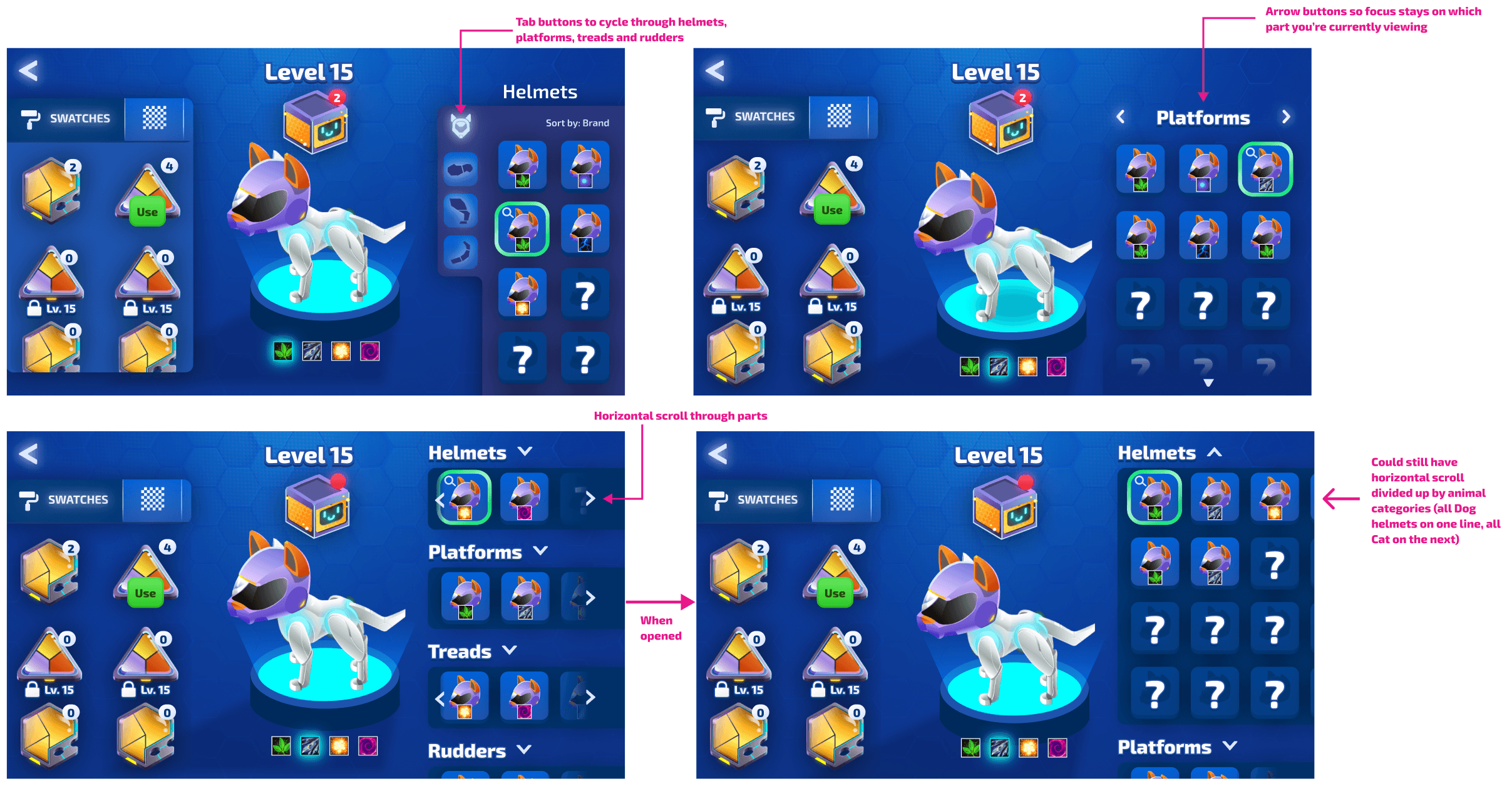
Iteration Option 1 moved key selections to the left column, and perusal information to the right column. Part selection remained in the middle, in the context of the character preview.
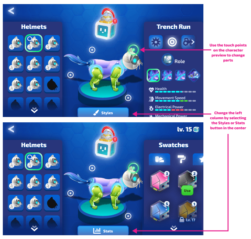
Iteration Option 2 showcased part selection as touchpoints ON the character preview, and a button selection to change the information in the right column, between stats and cosmetics
Iteration Option 3 cleared the columns of their background fills, making the preview character feel less cramped. It also explored bringing the bottom navigation bar into display, and keeping the button selection to swap the right column information.
We launched with Iteration Option 2.
What didn't work
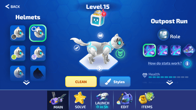
While this layout was an improvement from the original mockup, the touchpoints on the preview Zo-gear confused users.
There was no proximity connections between the touchpoints and the Gear items on the left.
I assumed users would want as much information upfront as we could manage, but what users needed was progressive disclosure.
I didn't push back hard enough on the game designer's requirements, which led to a still cramped, overwhelming interface.
What I learned
Consolidate similar actions together to reduce cognitive load.
Display information with progressive disclosure, rather than all information upfront.
MVPs should ship with the minimum viable UX, not just minimum features.
Turning Point 2: Iterating for new requirements
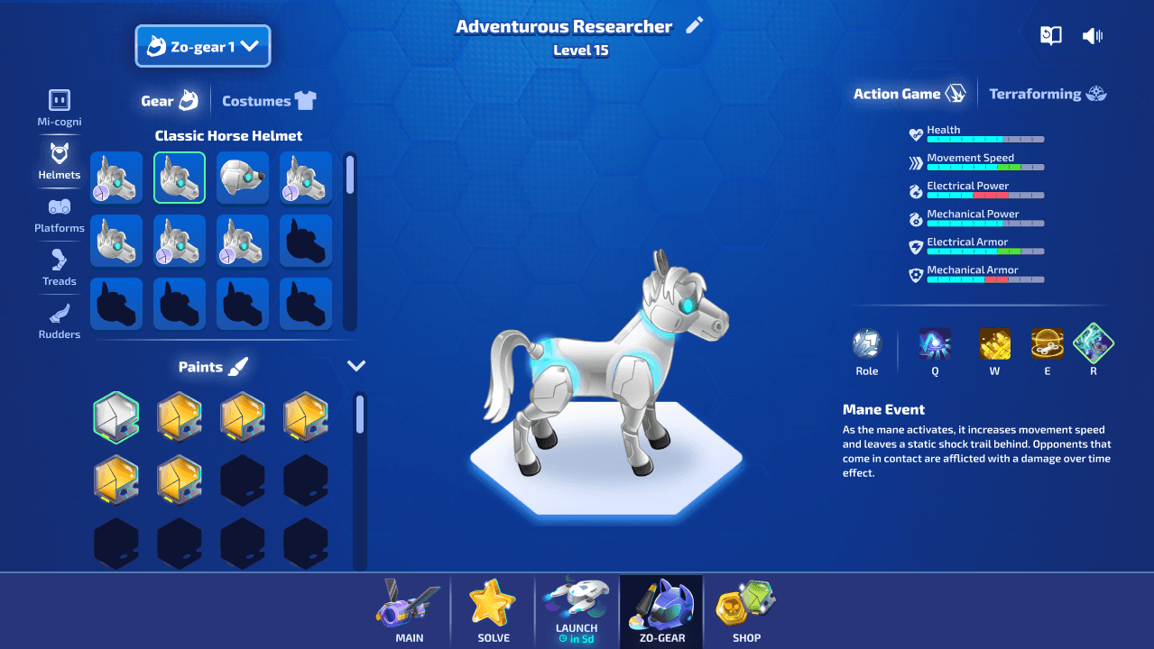
Several months after launch, new requirements emerged, which introduced:
A loadouts feature, where users could save 5 different Zo-gear configurations
Different game mode stats
A nickname feature with editing capabilities
I decided to use these new requirements as a chance to improve other pain points identified after launch.
We essentially launched an alpha version, now it's time to build out the official 1.0
Multiple pain points were identified by internal and external users after launch.
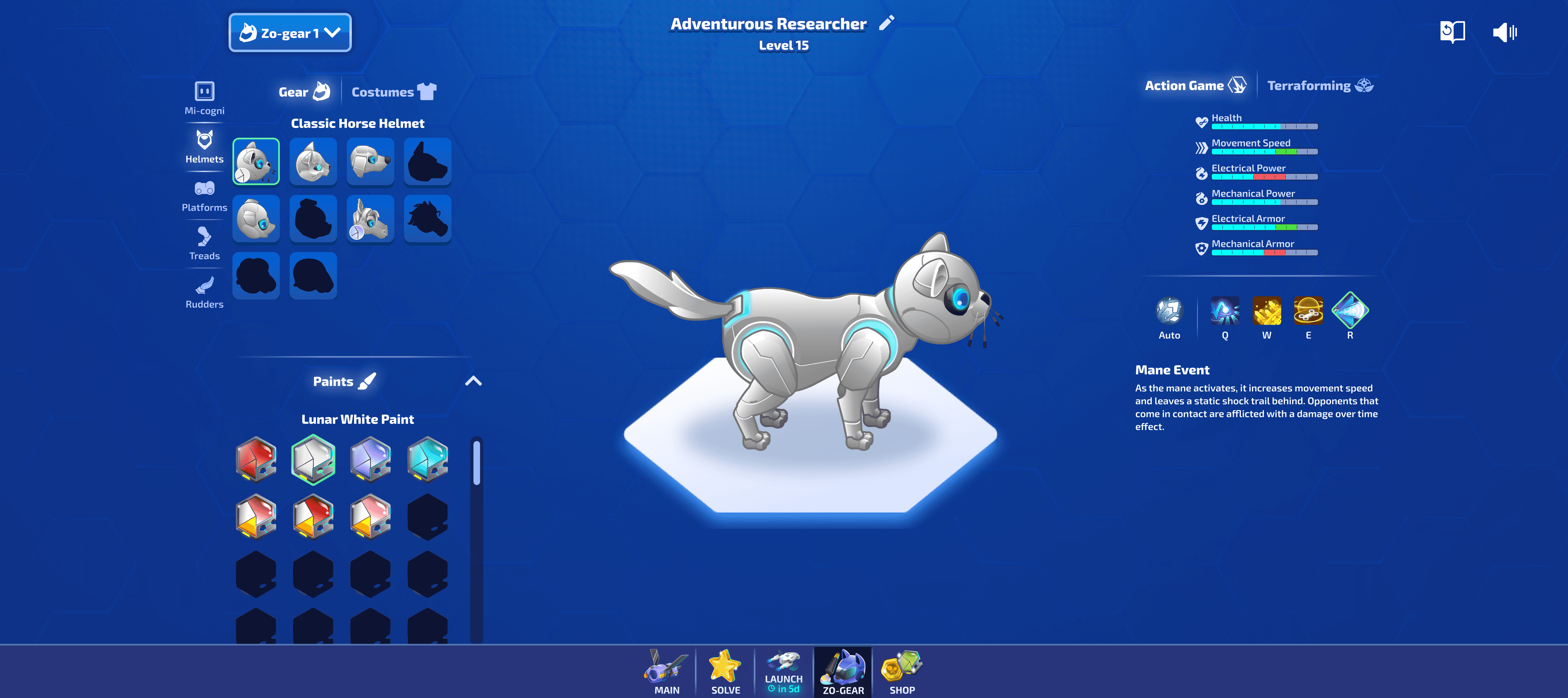
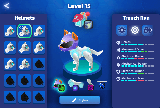
With the above changes, navigation became much more intuitive, with a clear "action" column for all customizations, and a clear "information" column for stats and ability information.
Click below to try the final prototype!
Or click below to watch it live!
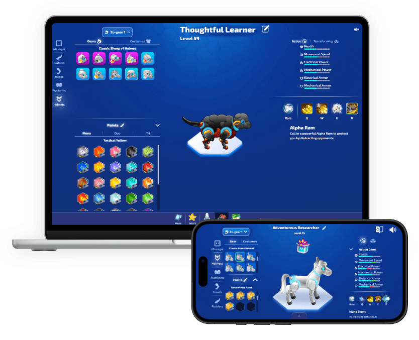
Responsiveness was also important, as most users use chromebooks, tablets, or laptops in schools.
Responsiveness
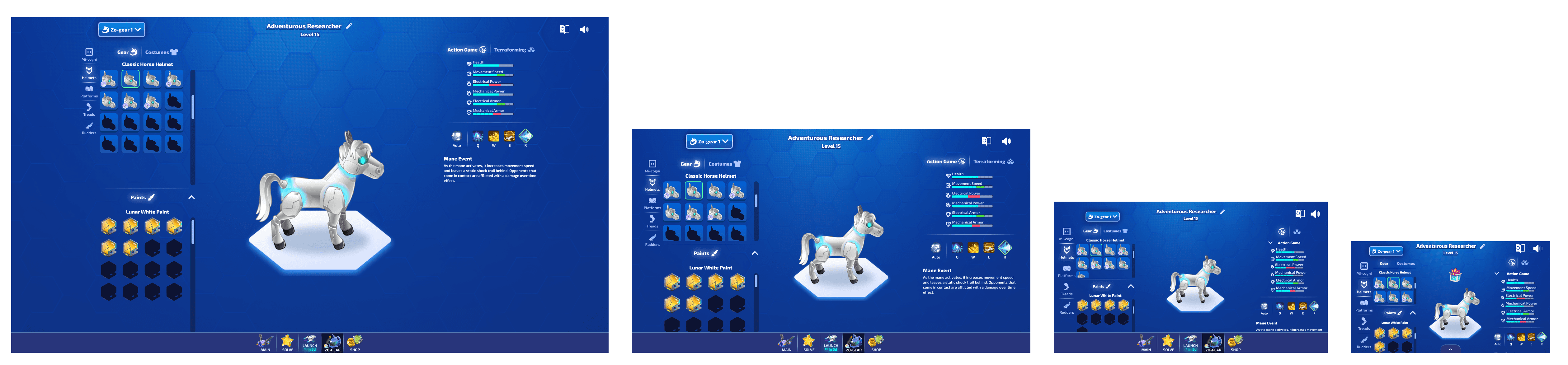
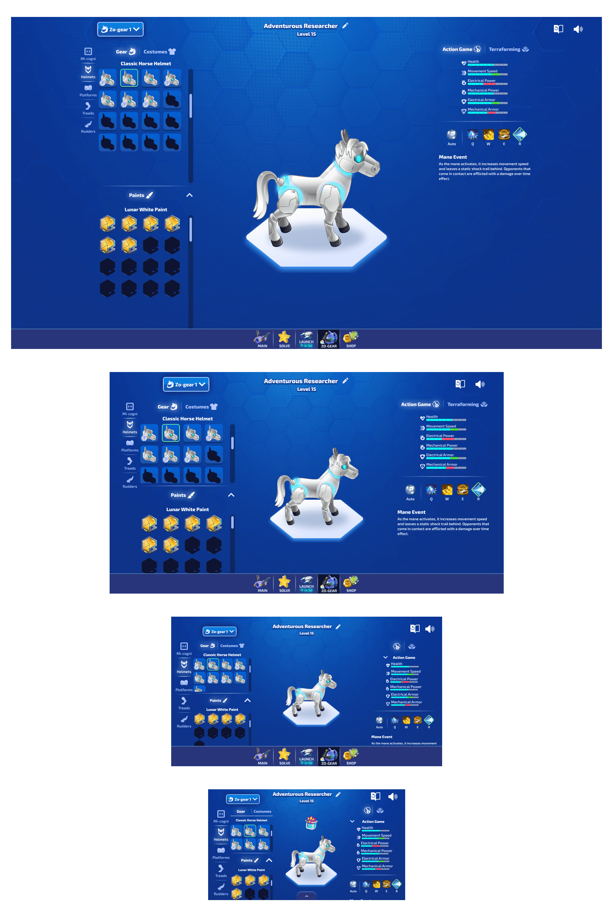
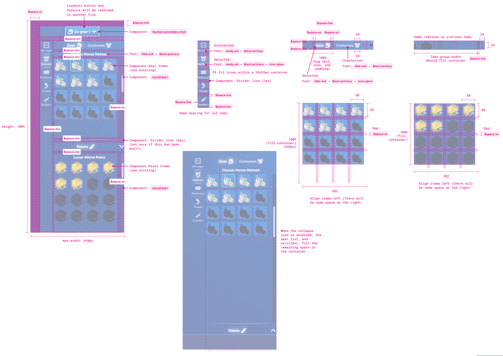
I ensured the layout was responsive, showcasing the layout at various different breakpoints so engineers knew what it was supposed to look like while they were making the changes.
Redlines
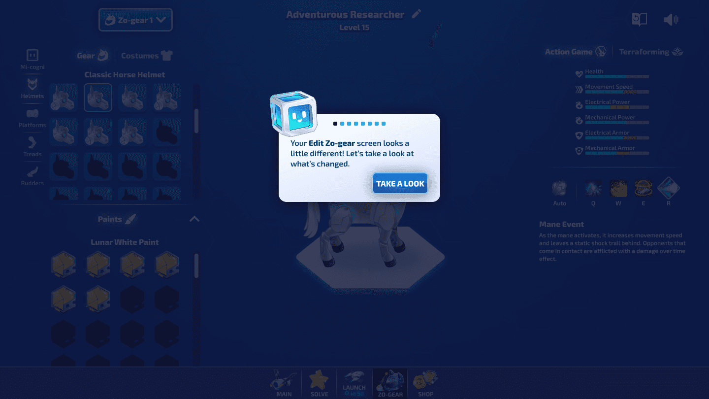
Tutorial for Release Updates
Because there were some pretty large changes, I outlined a tutorial flow, to guide users through the changes, and teach them how to use the interface.
Click beside to view the guide!
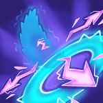
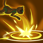
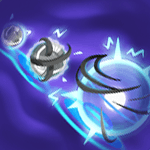
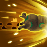
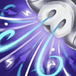
Ability Icon design
I had the opportunity to create all of the Zo-gear ability icons you see in this interface.
Dog skills


Cat skills

Pig skills

Horse skills


Sheep skills


Each row represents a Zo-gear animal's basic abilities. Each ability followed a ruleset and colour guidelines that I defined.
It was important to maintain readability from a distance. Each icon needed to be unique, and accurately show how the skill works.
I designed all of these icons in Procreate on my iPad.
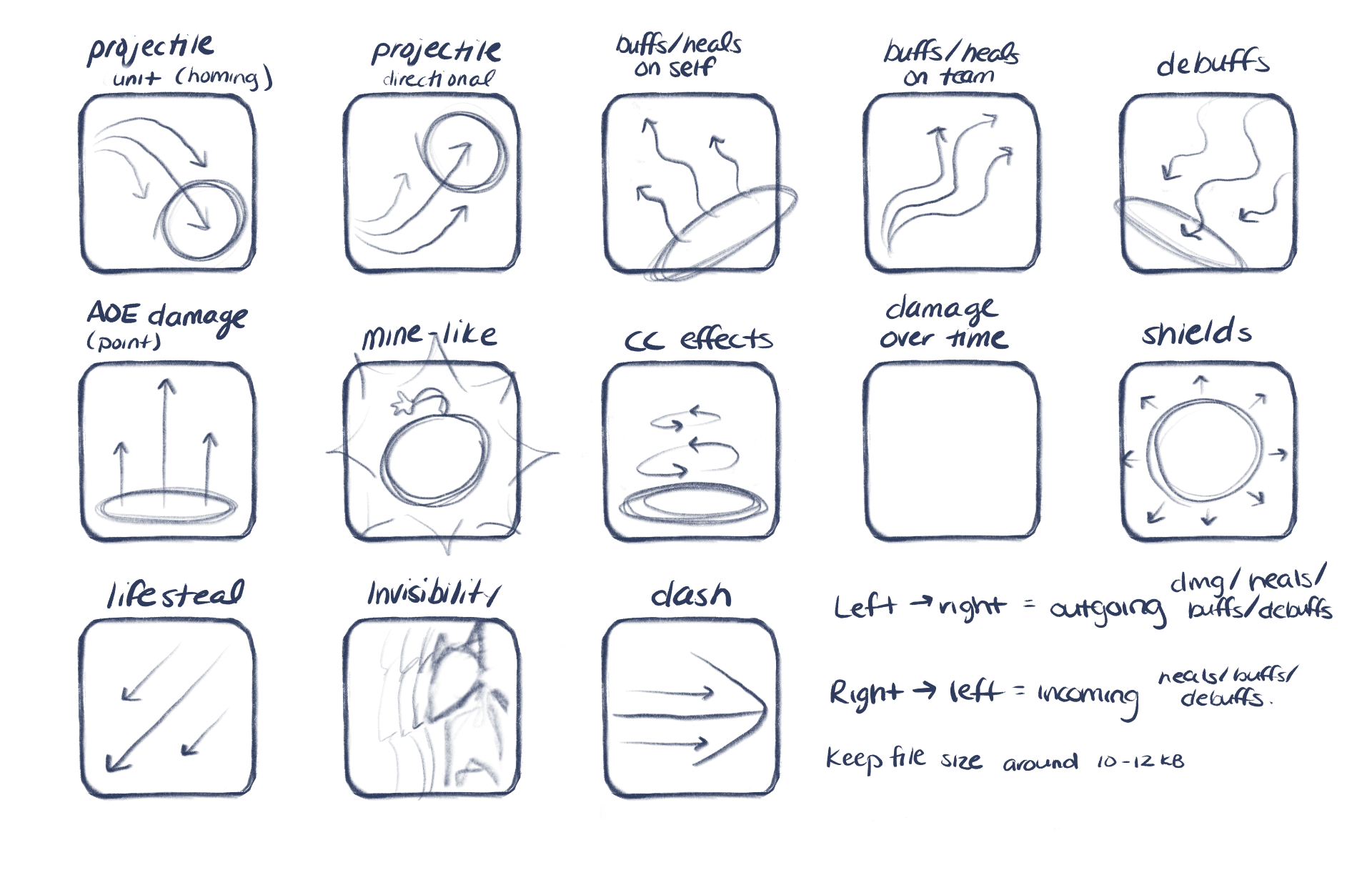
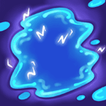
Basic Abilities:
Basic abilities followed a muted color palette, to represent that they had a neutral damage type.
Contrast was important to show the ability shape and maintain readability from a distance.


Impact
The 1.0 design shipped and has remained stable since.
The comprehensive redline specs, responsive layouts, and prototypes I provided made implementation smoother for engineers.
Shipped an improved interface
It was responsive, intuitive, and served user needs
Increased user customizations by 20%
Compared to MVP launch
Improved user engagement
Allowing users to immersive themselves more in the game world
Reflection
What I learned
This project changed how I approach complex interface design:
Group related actions together so users can complete related tasks in proximity.
Use hierarchy, progressive disclosure, and clear separation between actions as ways to fit large amounts of information on screen without overwhelming users.
MVPs with low scope are required, and planning and executing improvements later is sometimes necessary.
What I would still explore
Improved navigation between the Gear selection and Costume selection to make the transition and connection between the two more clear.
Spatial, or Diegetic UI design that uses an illustrated background image to better immerse the user in the game world.

Contact me: aszczepanowski@outlook.com
Copyright © Amy Szczepanowski 2026