StoryGraph: UI Redesign
UI Overhaul & UX Considerations
Case Study Intent
This project is a visual and UI design exploration focused on elevating hierarchy, consistency, intuitiveness, and brand expression within the StoryGraph app. The goal was not to reimagine product flows or introduce new features, but to explore how a stronger design system and refined visual language could improve clarity, cohesion, and emotional tone, while working within the app’s existing structure.
Why StoryGraph?
I'm an avid reader, who loves to keep track of everything, organize and categorize everything I do. I started using StoryGraph at the beginning of 2025 and loved the premise. I think the product holds a lot of value and promise, but it's losing users with it's lack of strong brand identity, inconsistent hierarchy, and bland visuals.
My Role
As this is a personal project, my role is UI Designer, but I put special consideration into to graphic / logo design, brand development, and creative direction.
The Problem
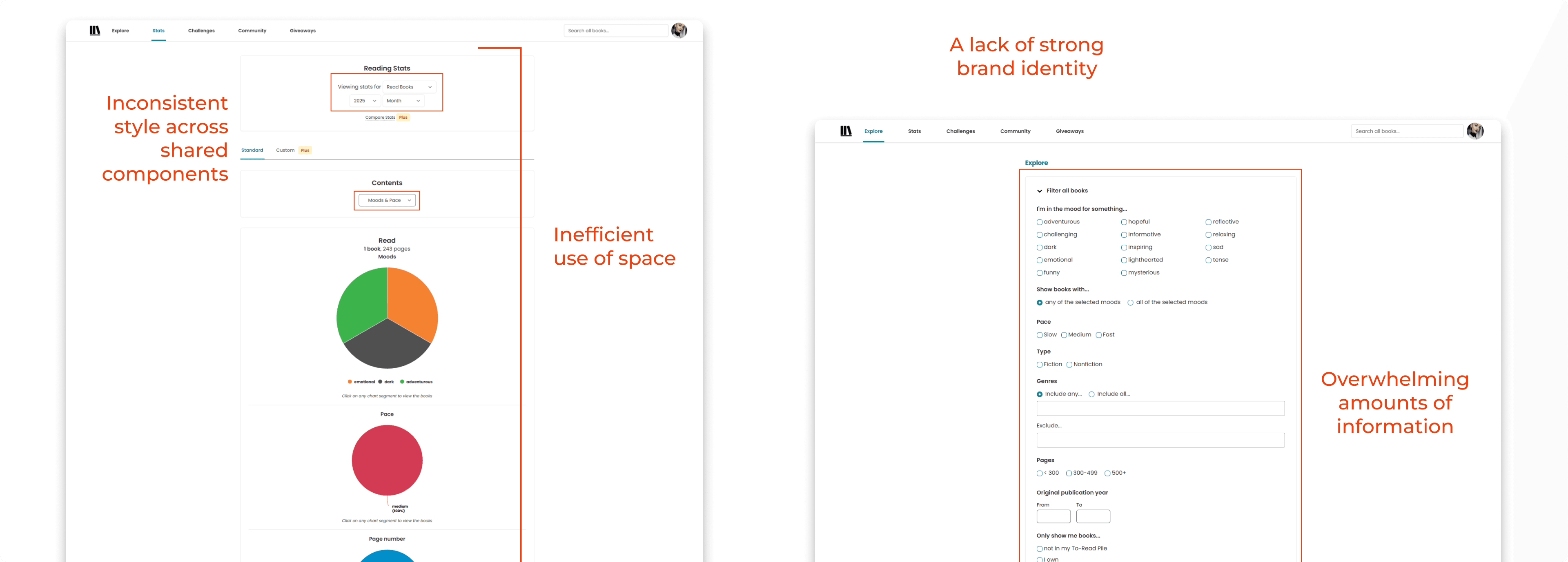
Inconsistent components
Similar elements are styled differently across screens
Unclear understanding of how to use some buttons, tabs, and filters
Brand expression
Visual language doesn't fully express the story and narrative warmth of the brand
Inefficient hierarchy
Page layouts don't make efficient use of space, for all the information being shared
Some pages share too much information up front, which leads users to feeling overwhelmed
The Goals
Increase the visual hierarchy while decreasing the visual noise
Create a cohesive Design System that elevates the brand identity and improves component consistency across the website and app
Improve the responsive experience on mobile devices
My Process
Designing a Scalable Design System
Before redesigning any screens within the application, I first focused on creating a scalable, reusable design system that could support StoryGraph’s existing features while allowing room for future growth. I aimed to improve consistency, accessibility, and brand expression across the entire product. This ensured that every screen redesign was not just visually improved, but systemically aligned.
Accessibility as a Constraint
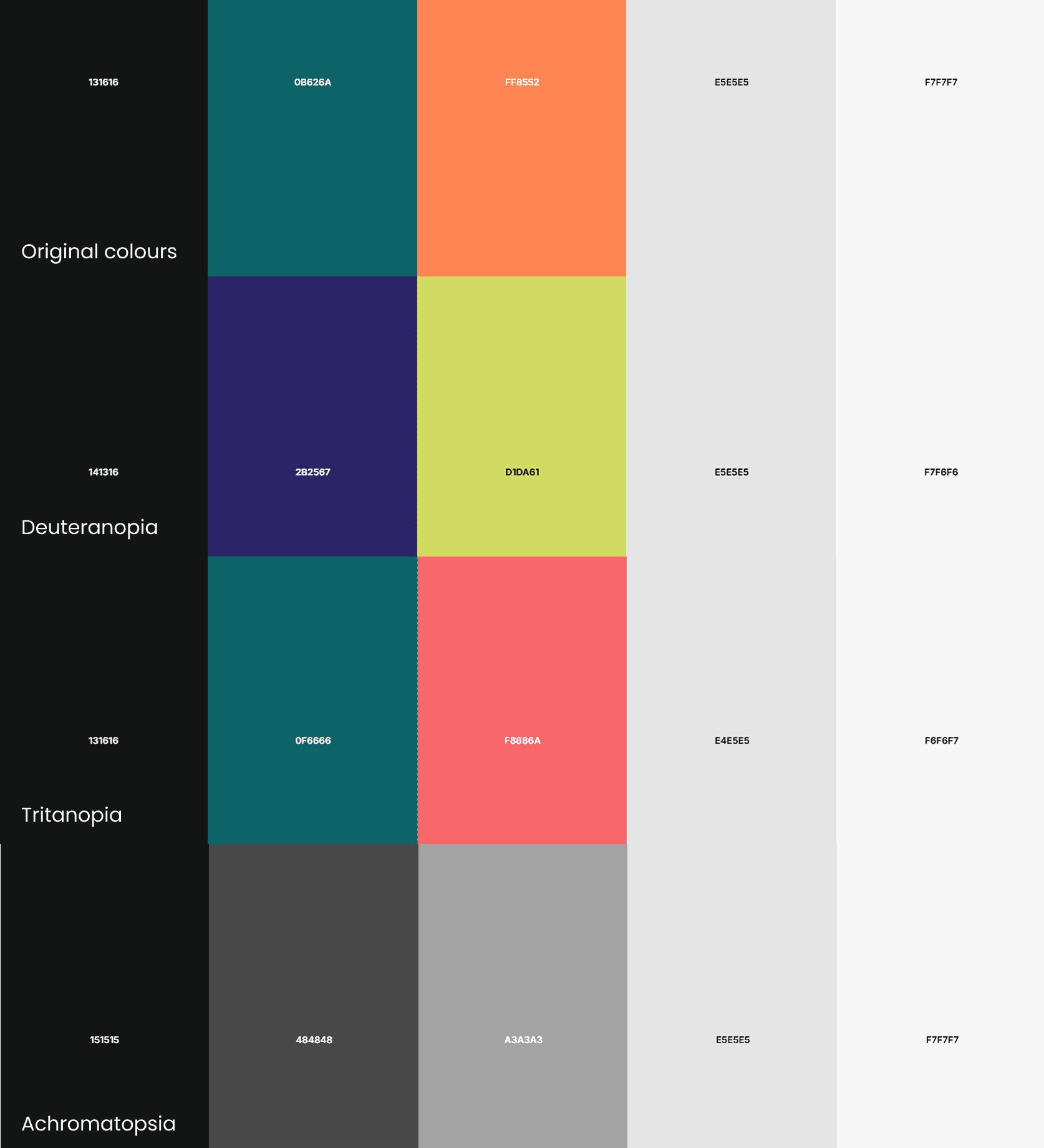
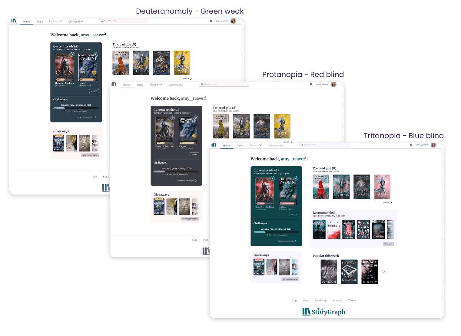
Accessibility was a core consideration throughout the process, not an afterthought. All color, contrast, and typography decisions were made with inclusivity in mind, ensuring the interface remains usable for a wide range of users. I considered color-blind accessibility by avoiding reliance on color alone to communicate meaning, and by ensuring states and hierarchy are reinforced through spacing, typography, and iconography.
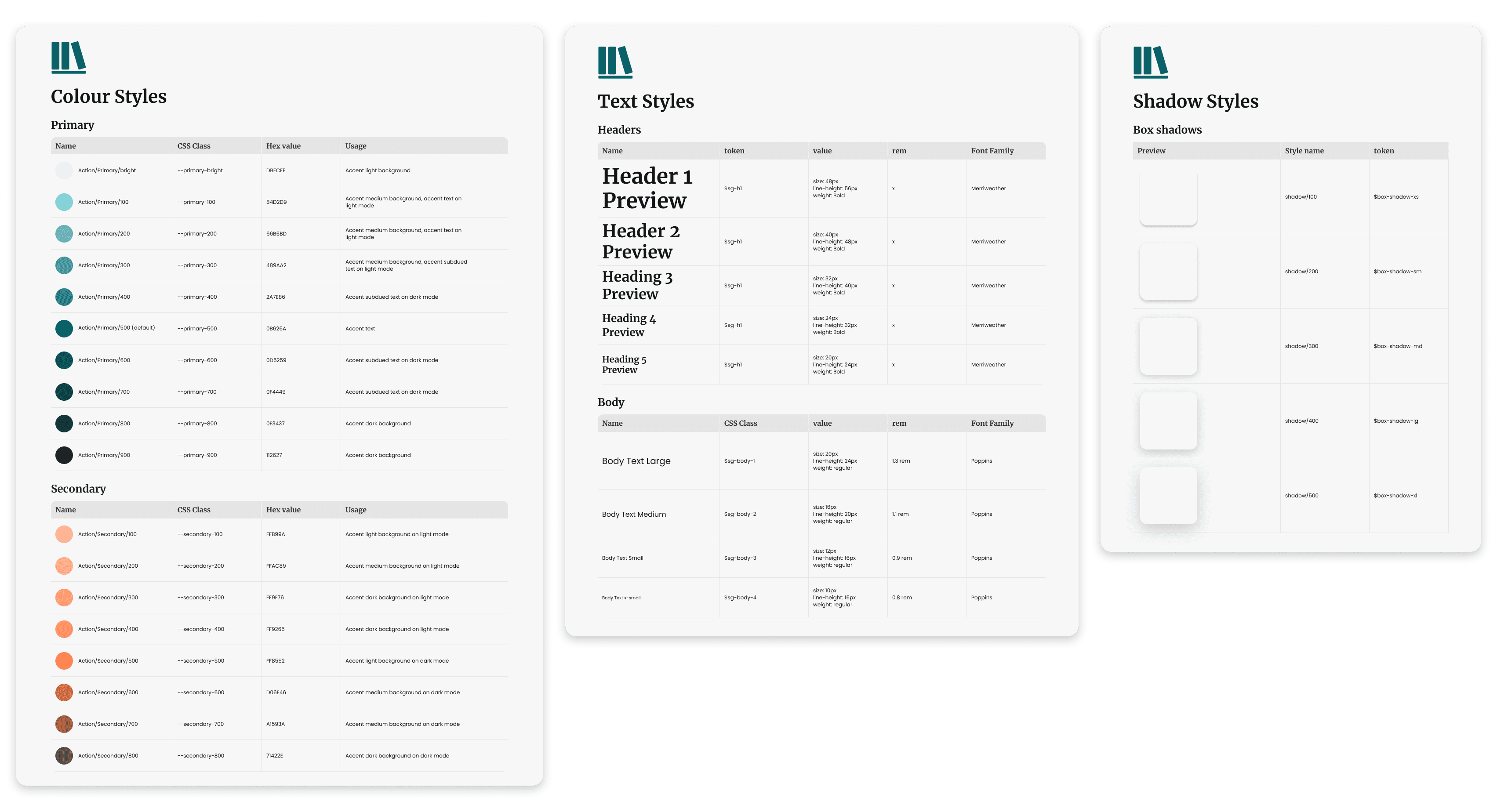
Colour & Typography
To reinforce StoryGraph’s identity as a platform rooted in reading and storytelling, I introduced a serif font for headings alongside a sans-serif font for body content. I wanted to find a balance between the warmth and familiarity of physically printed books with the clarity and readability from modern digital interfaces.
Rather than reinventing StoryGraph’s existing color palette, I focused on enhancing and extending it. I increased the available colours for primary, accent, informative, and decorative colours.
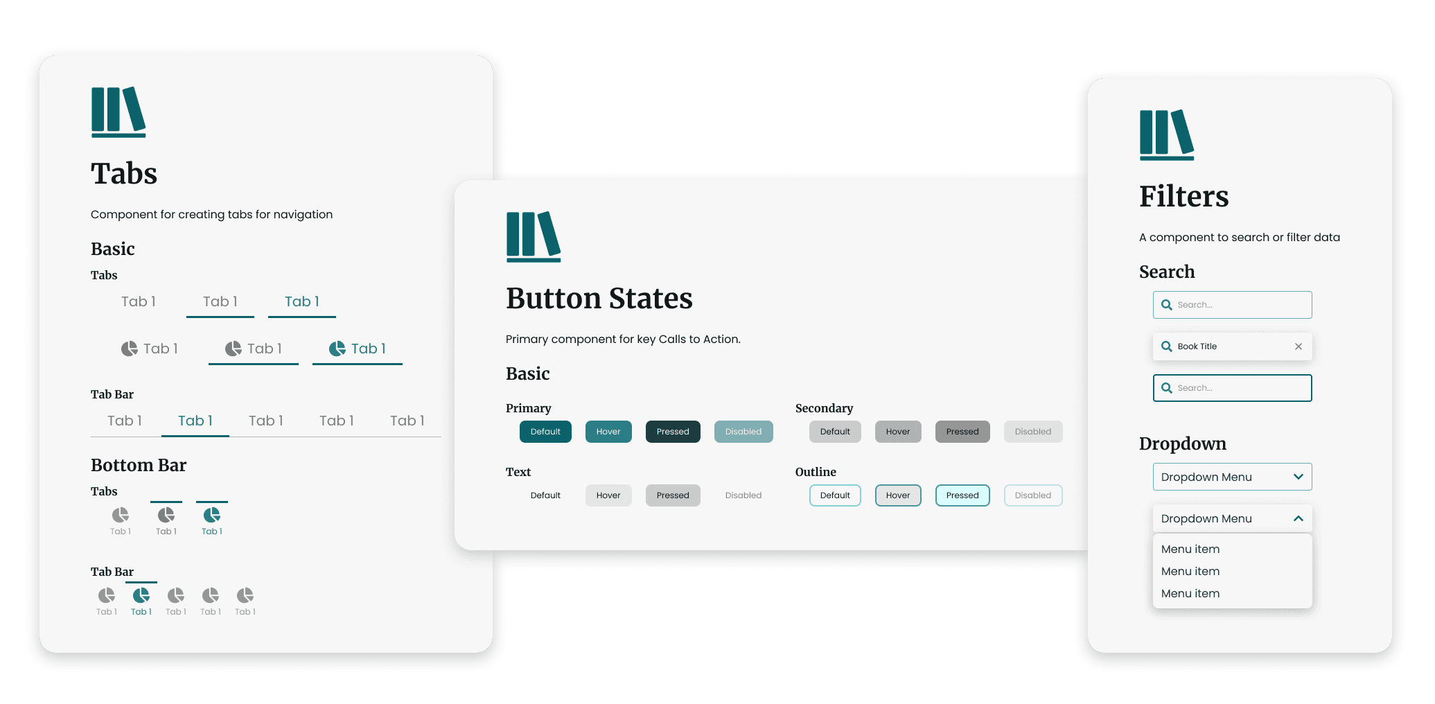
Components: Intentional and Scalable
I focused on an MVP set of components already heavily used throughout the app, thus ensuring every existing pattern had a consistent, reusable solution within the system. Each component was built with clear states, consistent spacing, and predictable behavior to support long-term maintainability.
Applying the System
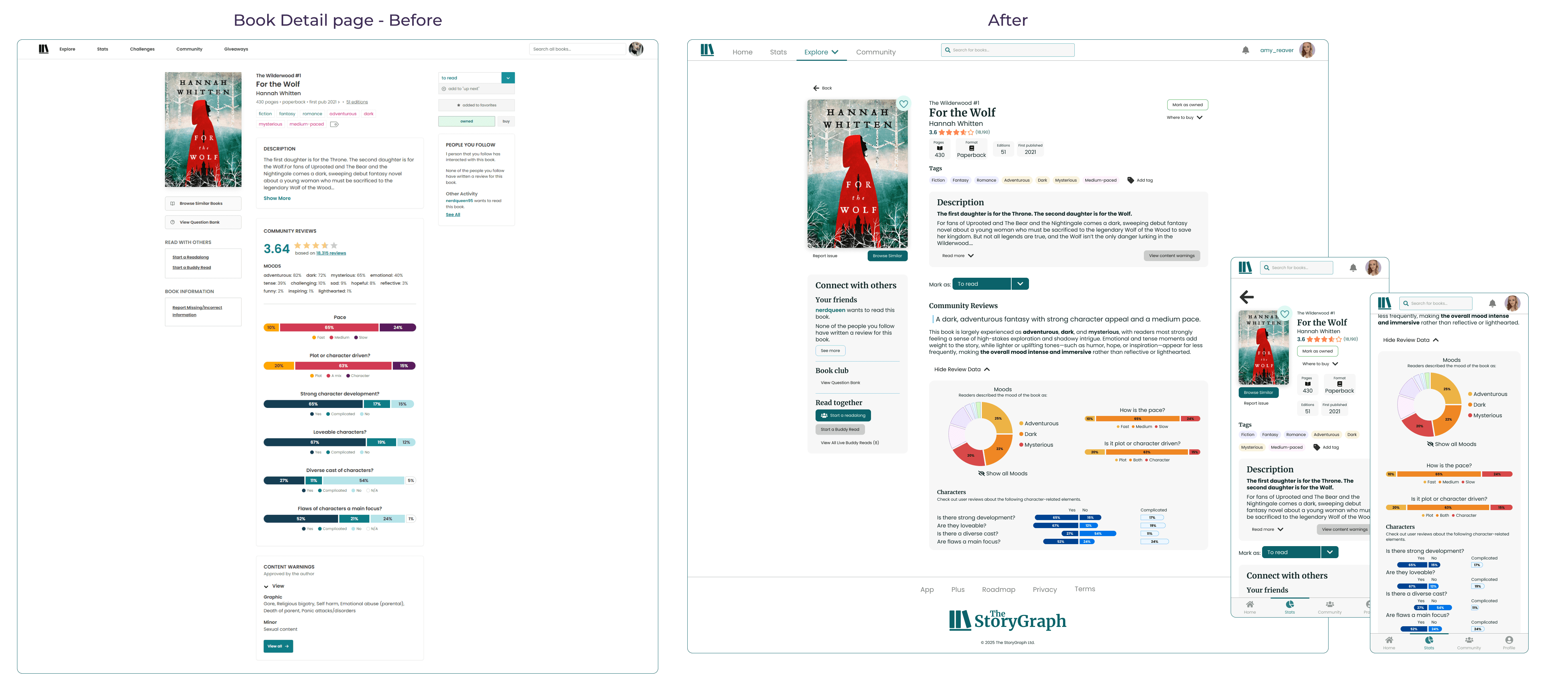
With the design system in place, I applied it to real product screens to validate its flexibility, consistency, and ability to improve clarity at scale.
I started with the Home Page, as it serves as the primary entry point into the app and touches many of StoryGraph’s core components: navigation, reading progress, recommendations, and user actions. This made it an ideal screen to validate both the design system and its ability to scale across complex content.
A UI audit of the existing Home Page revealed several recurring issues that appeared throughout the app:
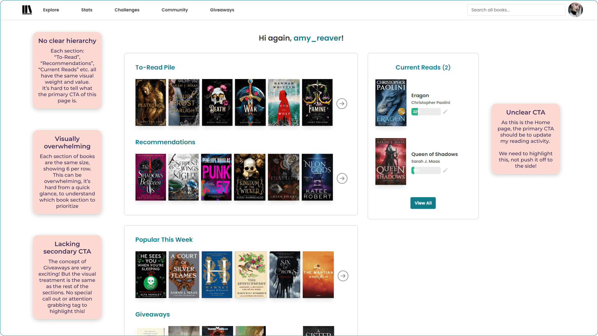
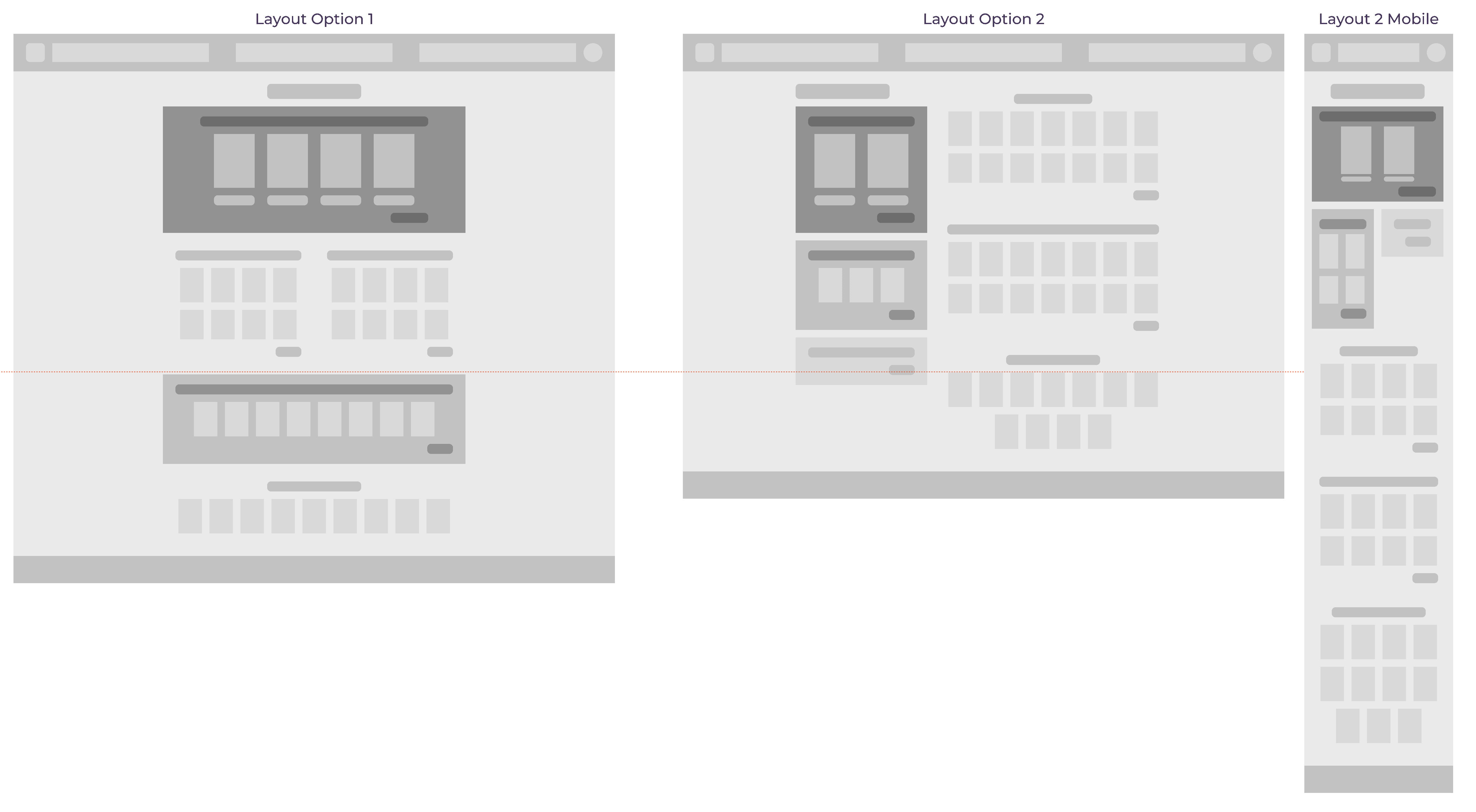
Before introducing visual styling, I explored a simplified greybox layout to clarify hierarchy, spacing, and content grouping. This step allowed me to focus on information flow and prioritization.
Once the layout was solidified, I created a high-fidelity prototype. Typography, color, spacing, and components were used consistently to reinforce hierarchy, improve readability, and express StoryGraph’s brand more clearly.
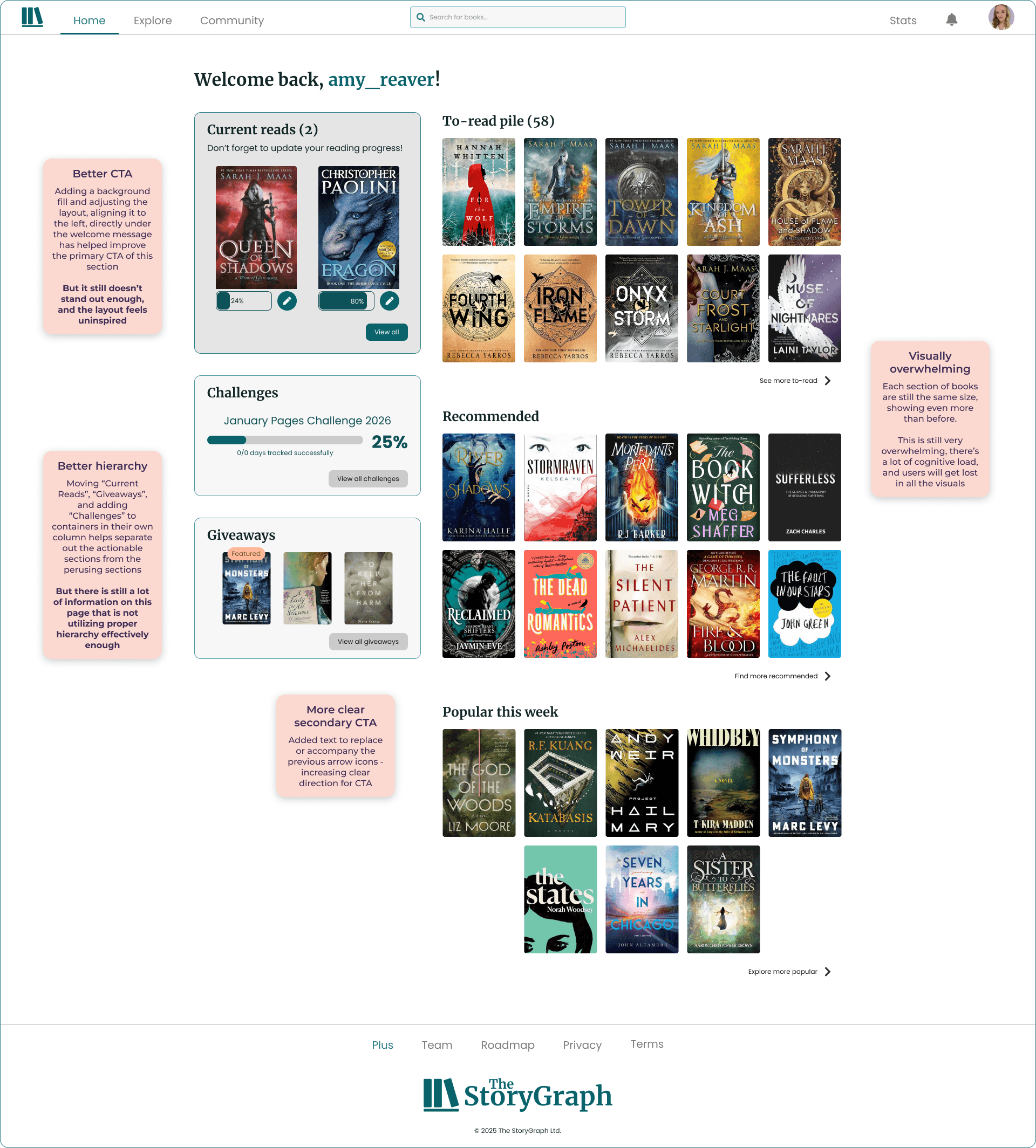
I designed a couple iterations, utilizing the design system I created. But neither of them felt like the best solution.
Iteration 1
Iteration 2
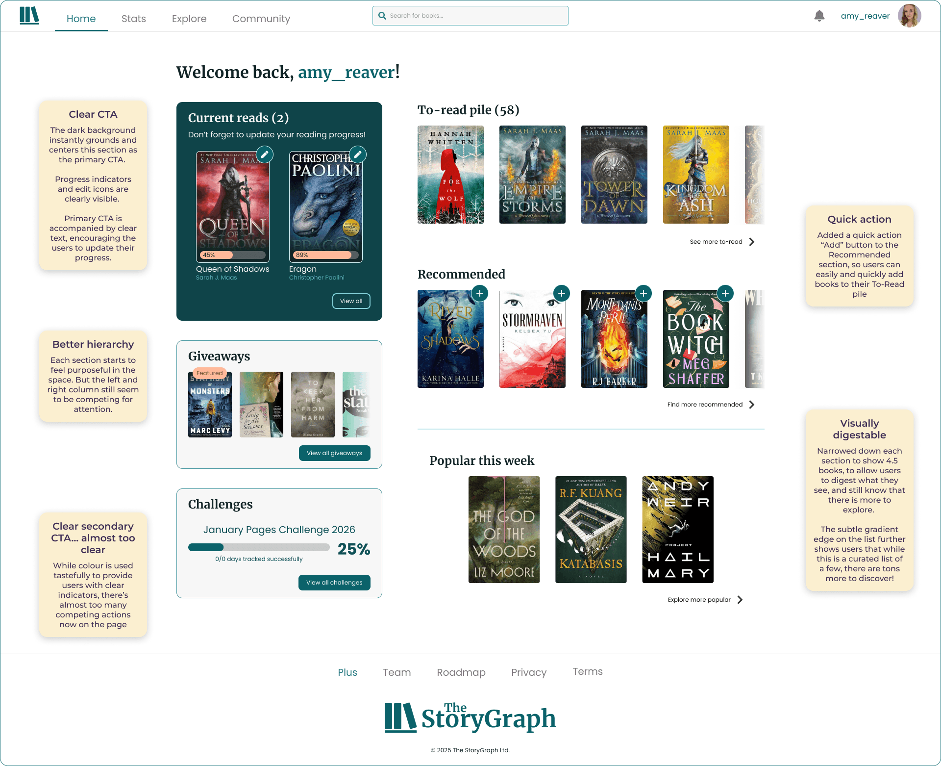
I used Chat GPT to identify key patterns and weaknesses within my redesign.
The final design
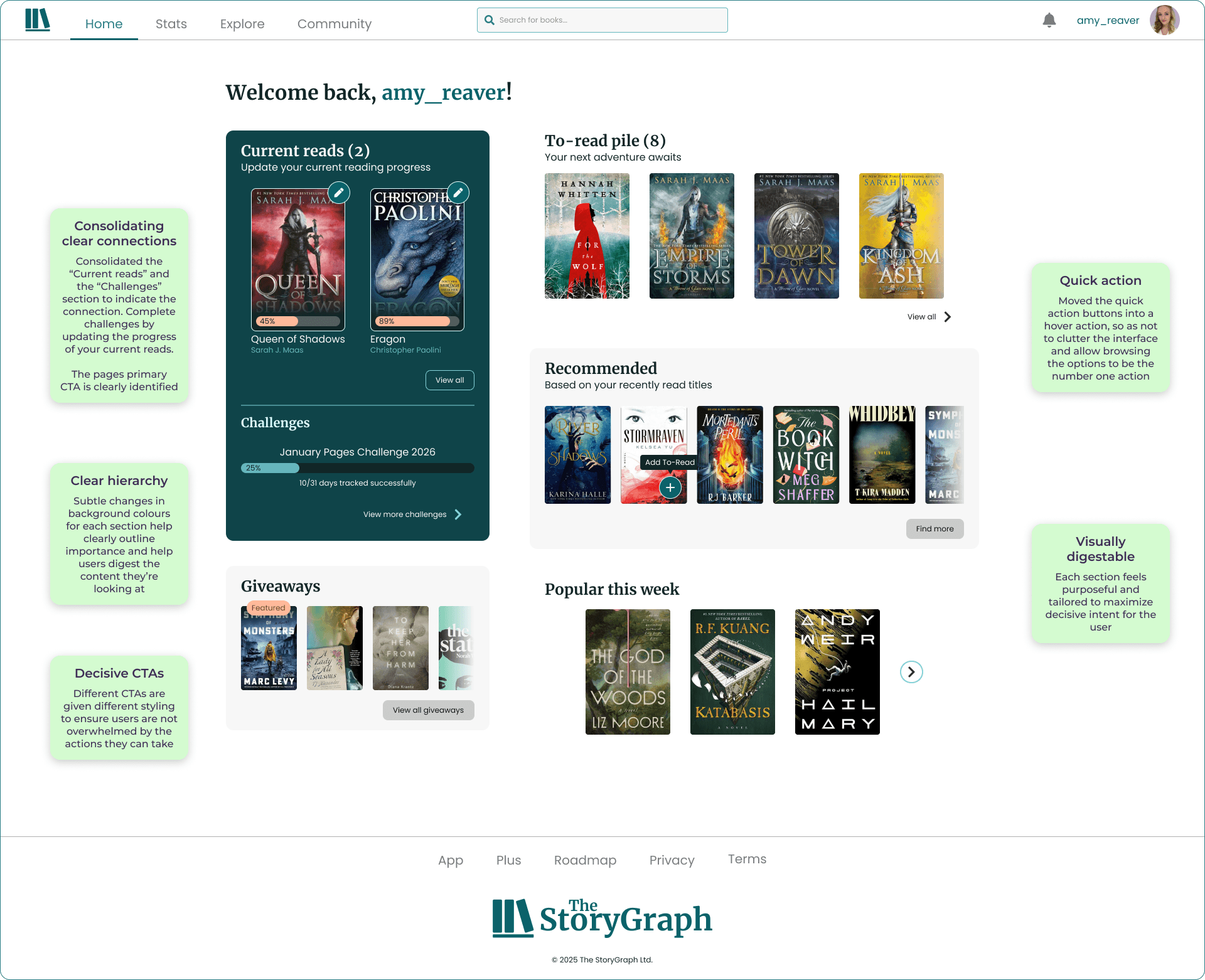
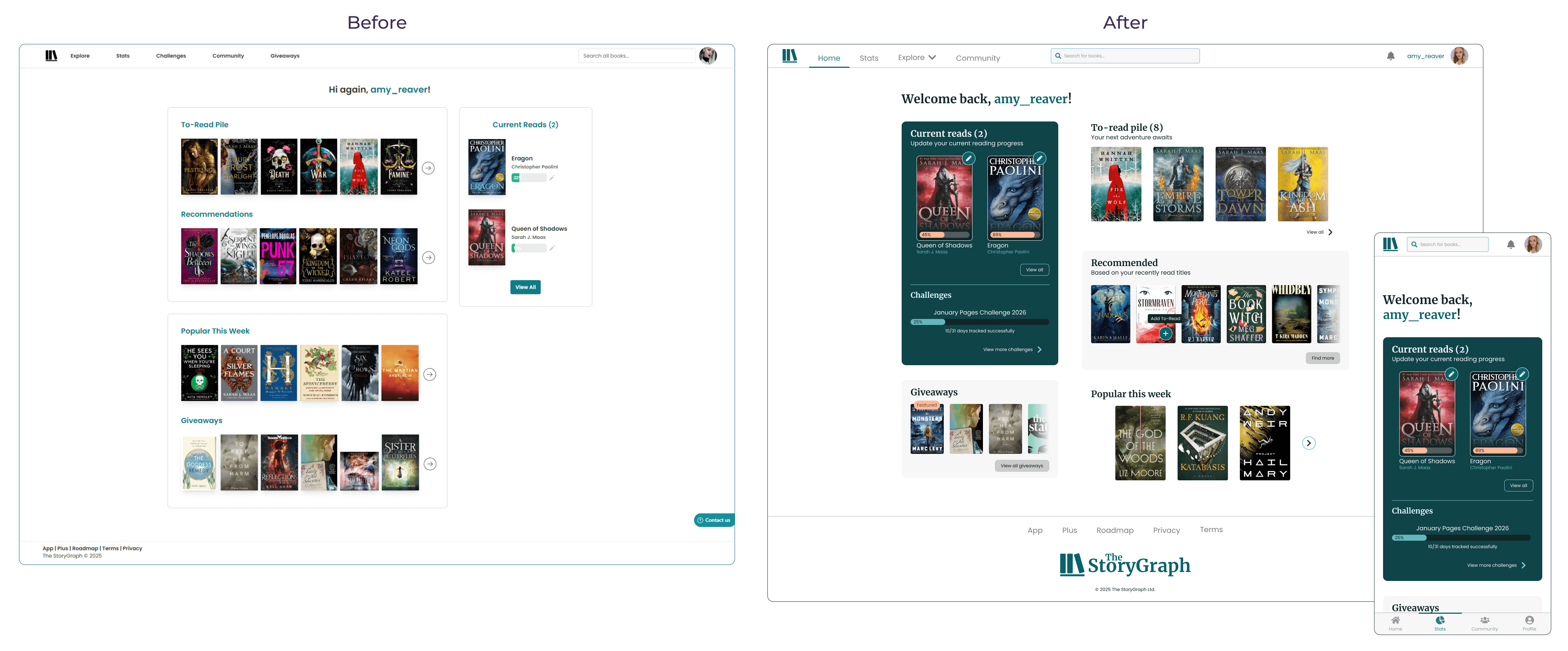
Noticeable improvements:
Consolidating clear connections
Consolidated the “Current reads” and the “Challenges” section to indicate the connection. Complete challenges by updating the progress of your current reads.
The pages primary CTA is clearly identified
Brand expression
The updated typography and colour scheme gives the home page a warm and inviting feel
Each CTA is given cohesive styling to ensure users are not overwhelmed by the actions they can take
Clear hierarchy
Subtle changes in background colours for each section help clearly outline importance and help users digest the content they’re looking at
More Before vs. Afters:
UX considerations
While this project focused primarily on visual design, UX considerations informed many decisions—particularly around hierarchy, affordance clarity, and accessibility. If this were a production project, I would validate these changes through usability testing focused on task completion, visual scanning speed, and accessibility contrast checks.
Outcome & Reflections
Increase the visual hierarchy while decreasing the visual noise
Create a cohesive Design System that elevates the brand identity and improves component consistency across the website and app
Improve the responsive experience on mobile devices


